DELIVERY HERO / KSA
Offer
Communication
Visioning
Reimagining how millions of HungerStation customers discover, understand & act on offers across every surface of the app.
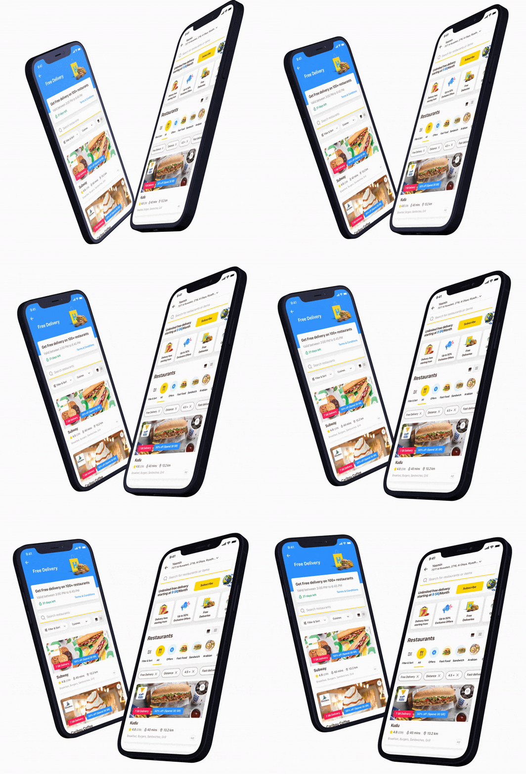 cover_animated-phones.gif
Reimagining how millions of HungerStation customers discover, understand & act on offers across every surface of the app.
cover_animated-phones.gifThe commercial impact was modelled hand-in-hand with the Finance team. The designs were then validated in person with real customers - zero changes arose from testing - before aligning GTM, Product, Tech & C-level leadership on prioritisation by business impact.
Business-as-usual continued uninterrupted throughout. Yet this single deep visioning exploration did something rare: it generated 18 months of prioritised product roadmap from one exploration.
Offers lived in their own corners of the app - capped at one per vendor, visually identical, hard to find, impossible to monetise.
I initiated a cross-functional visioning initiative to reimagine the entire offer experience - not as one screen, but as a reusable component system that could be injected anywhere offers appear.
As HungerStation continued to evolve, the offer experience had become constrained by incremental delivery. Individual features solved immediate problems, but the broader customer journey remained fragmented - offers scattered across multiple surfaces, inconsistent in presentation, & often difficult to discover. Customers could see only a single offer on vendor cards, discounted items were almost invisible during browsing, happy-hour promotions lacked visibility, & personalised benefits weren't always surfaced at the right moment.
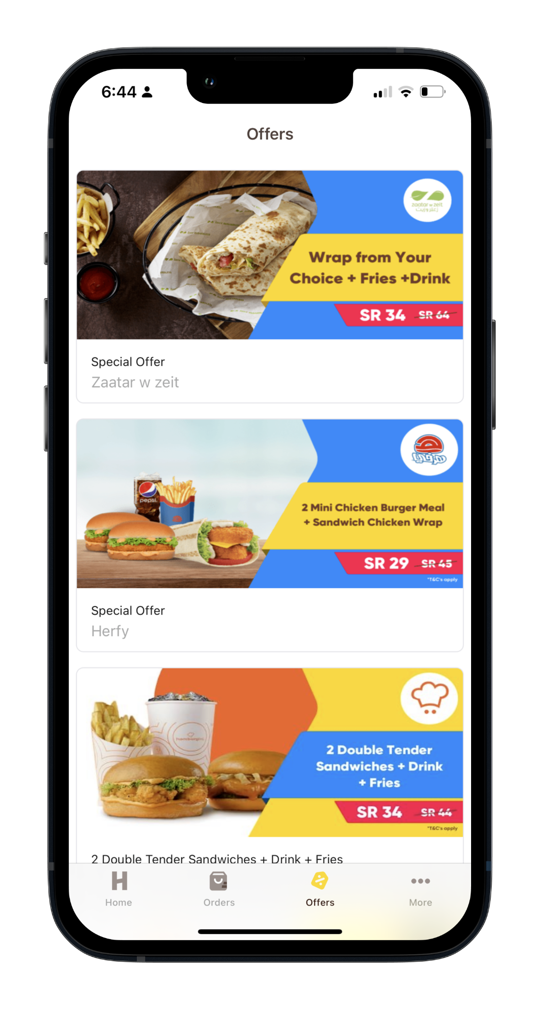
The impact showed in behaviour: from the Offers tab, only around 14% of customers progressed to a restaurant menu - a significant drop-off in engagement. At the same time, commercial teams had limited flexibility to promote campaigns or monetise premium offer placements.
The challenge was no longer to redesign another screen. It was to establish a unified vision for offer communication - one that could improve discoverability, support personalisation, unlock new commercial opportunities, & create a scalable experience system able to evolve across the entire product.
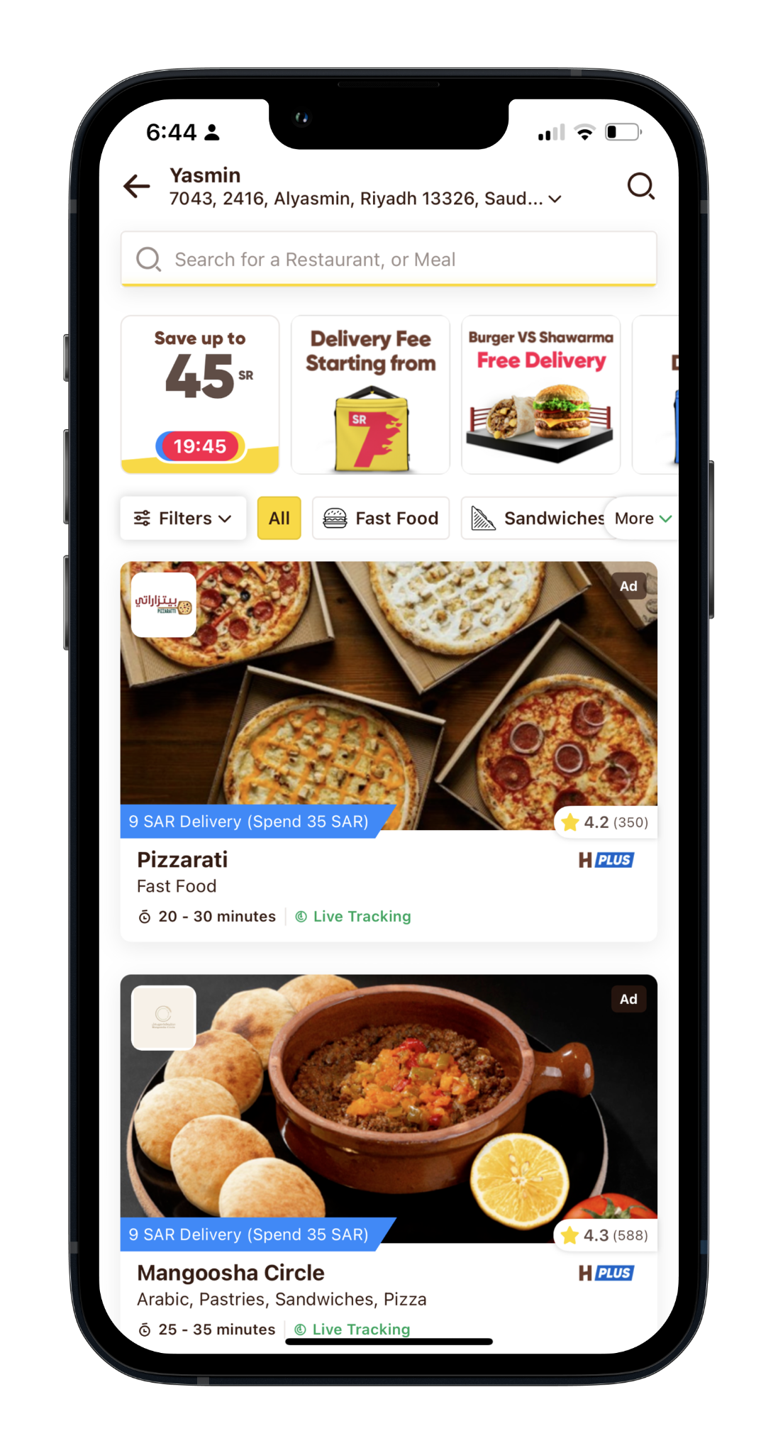
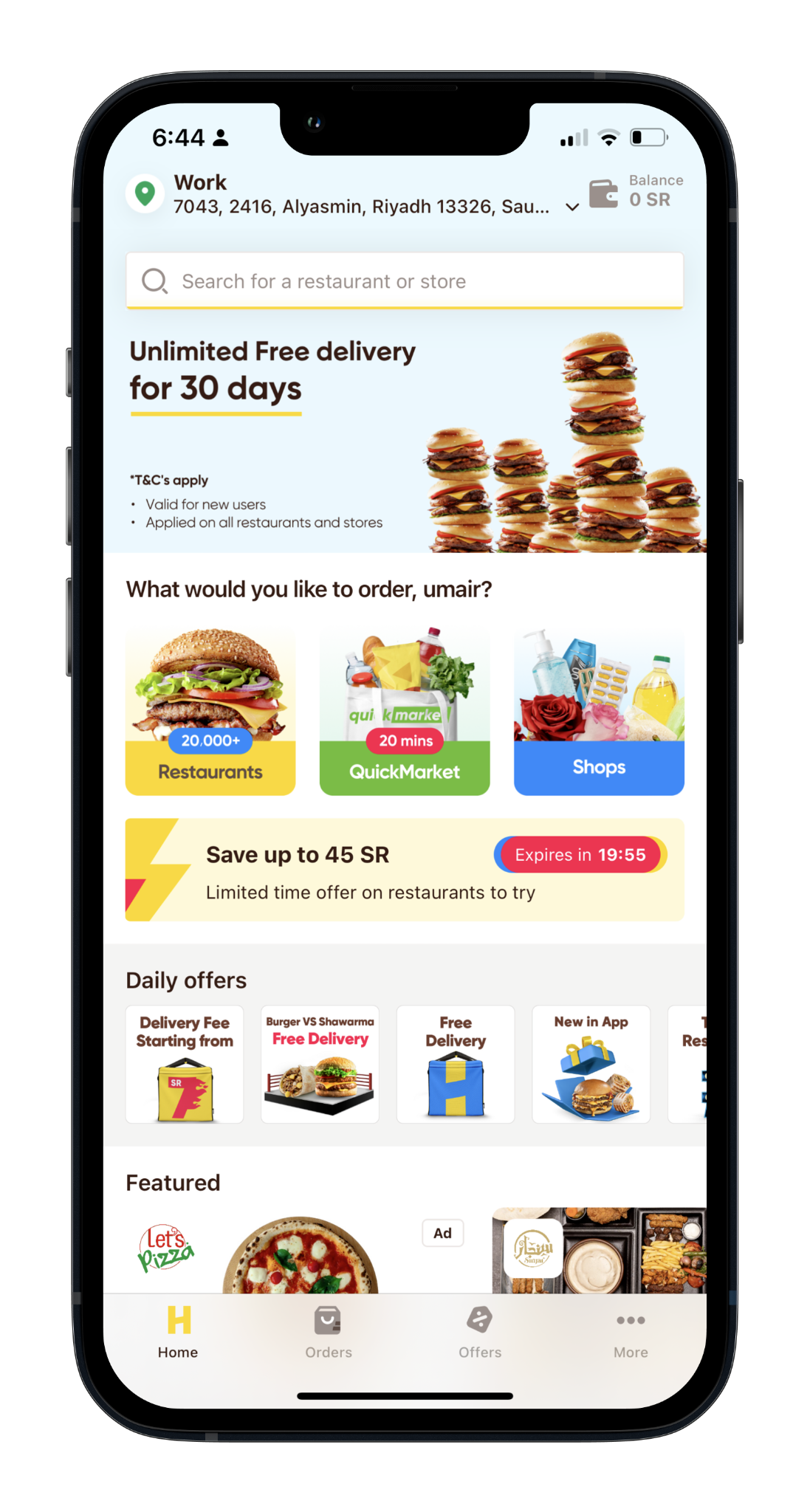
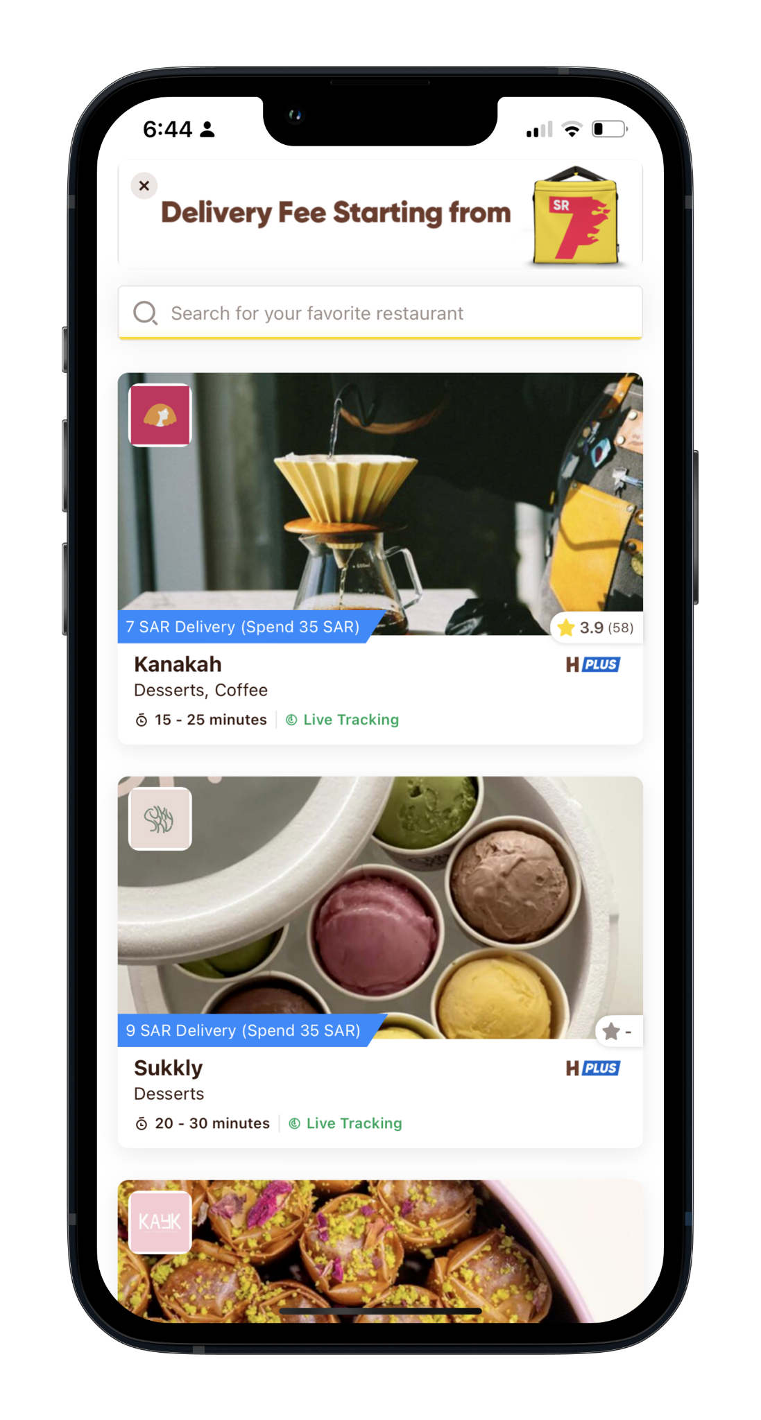
Core surfaces (current designs): Home Screen · Offers Screen · Food Vendor Listing · Campaign Listing.
 s09_scope_1.png
 s09_scope_2.png
 s09_scope_3.png
 s09_scope_4.png
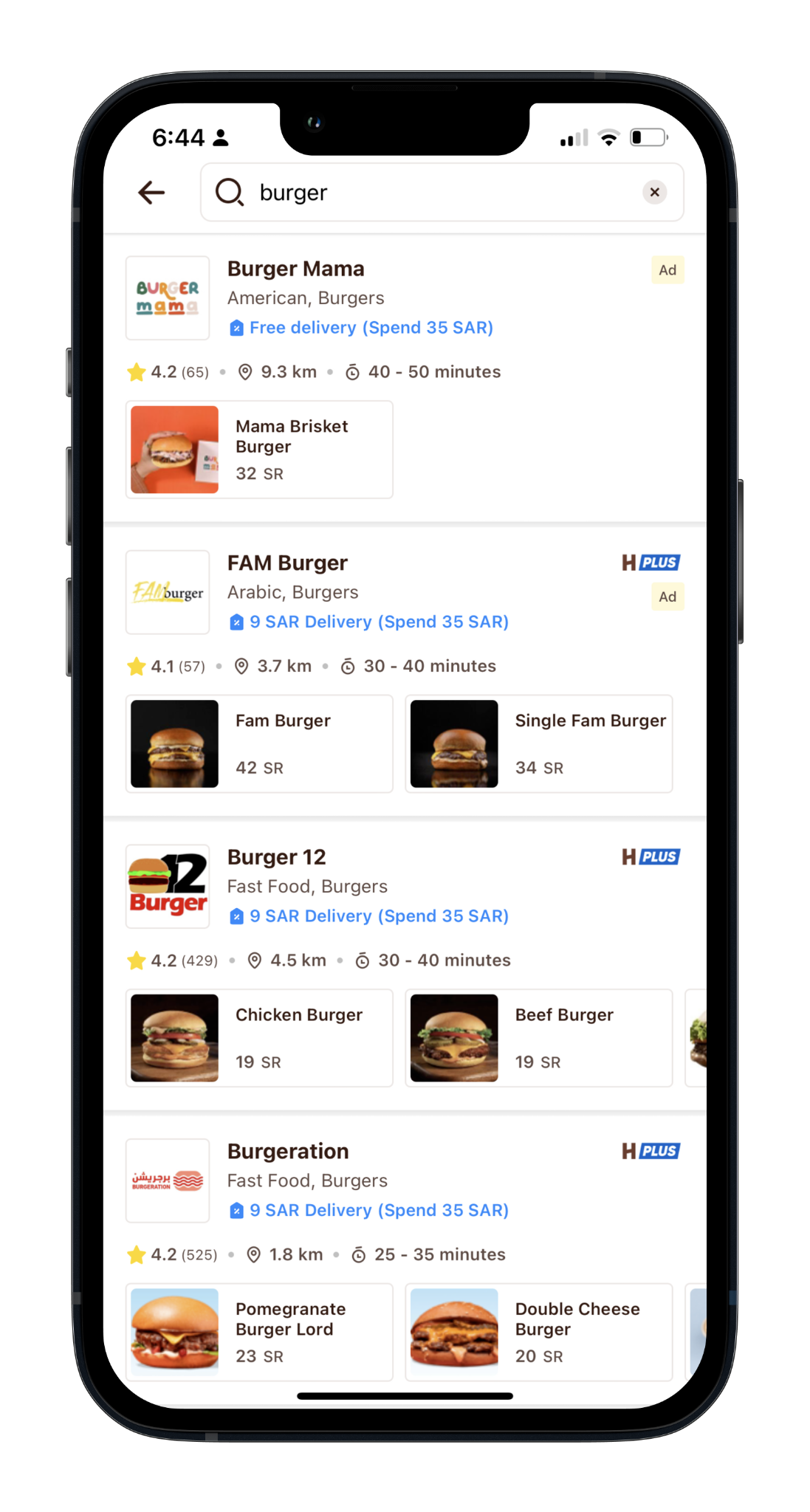
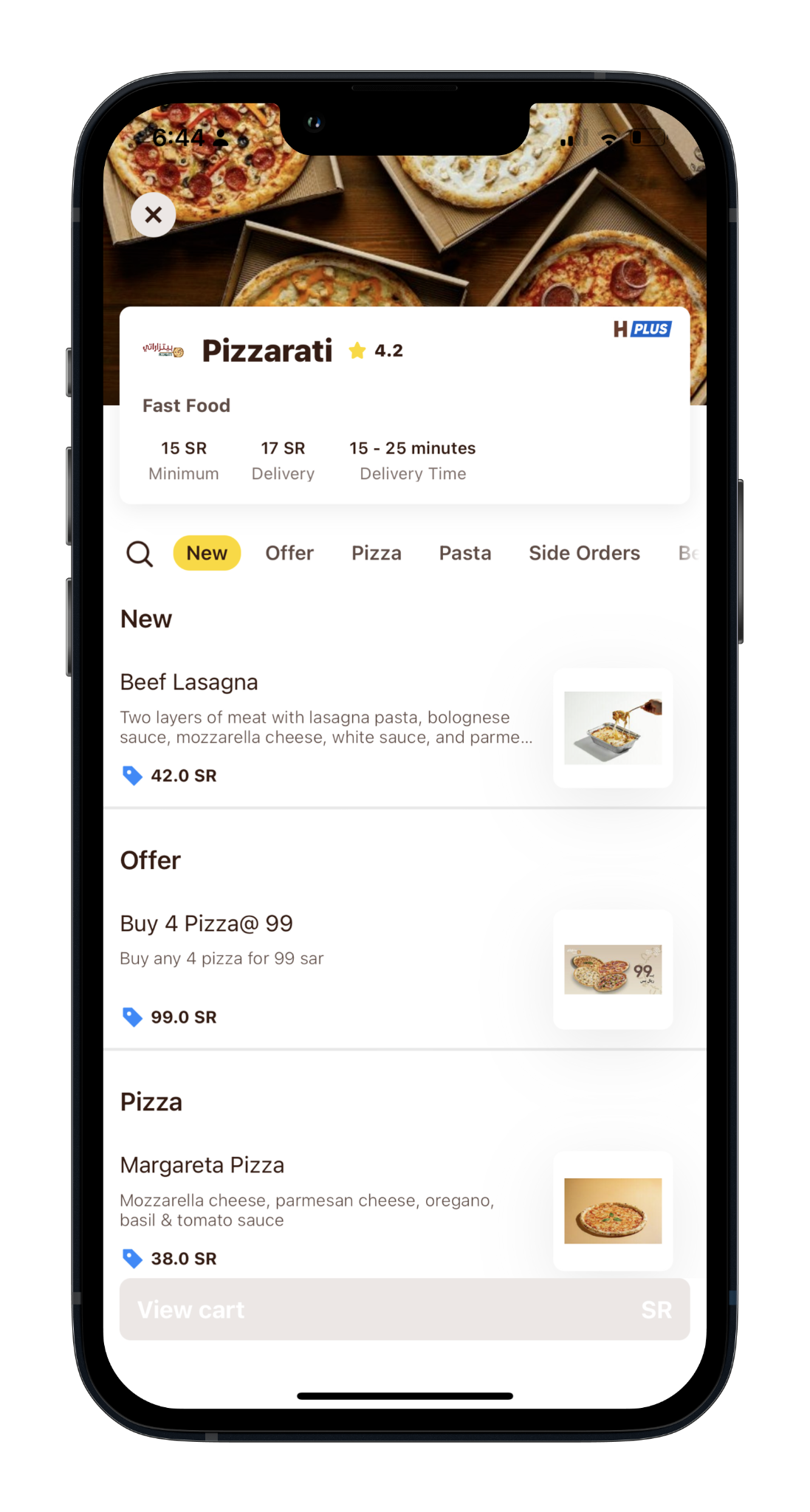
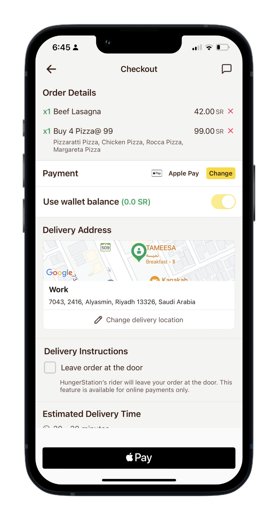
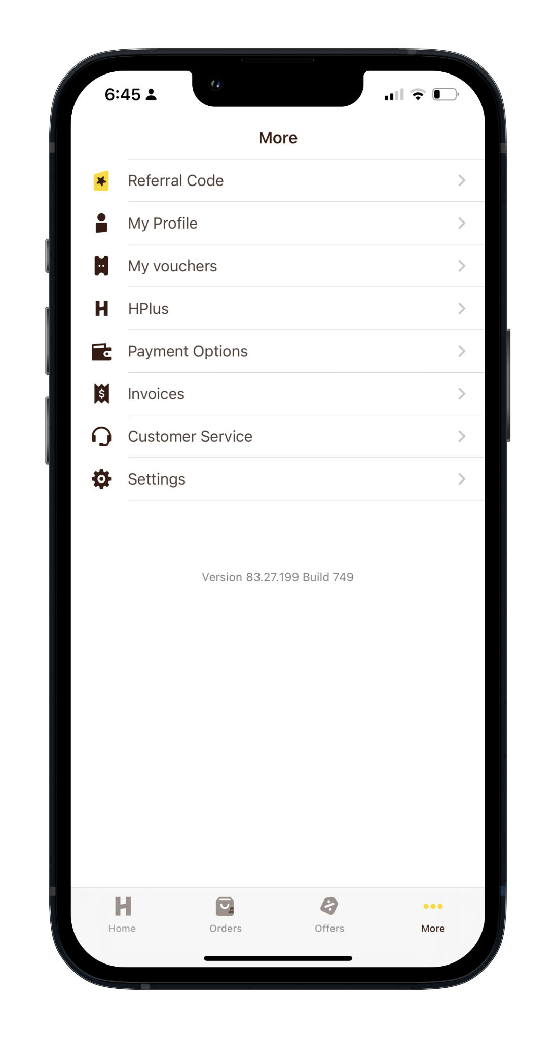
Further touchpoints (current designs): Search Results · Menu · Checkout · More Screen.
 s10_scope_1.png
 s10_scope_2.png
 s10_scope_3.png
 s10_scope_4.png
From a customer perspective, there are two key categories of incentive:
Incentives that require no user action, like a discount on a menu item. (Phase 1 of the offer communication visioning project.)
Incentives that require an action at checkout, like entering a code or picking a voucher from a voucher-wallet. (Phase 2.)
Free Delivery · Reduced Delivery Fee · HPlus Free Delivery
Fixed amounts · Percentage reductions · Spend-X-to-get-X · Buy-X-get-Y (e.g. buy one get one free) · Offer countdowns
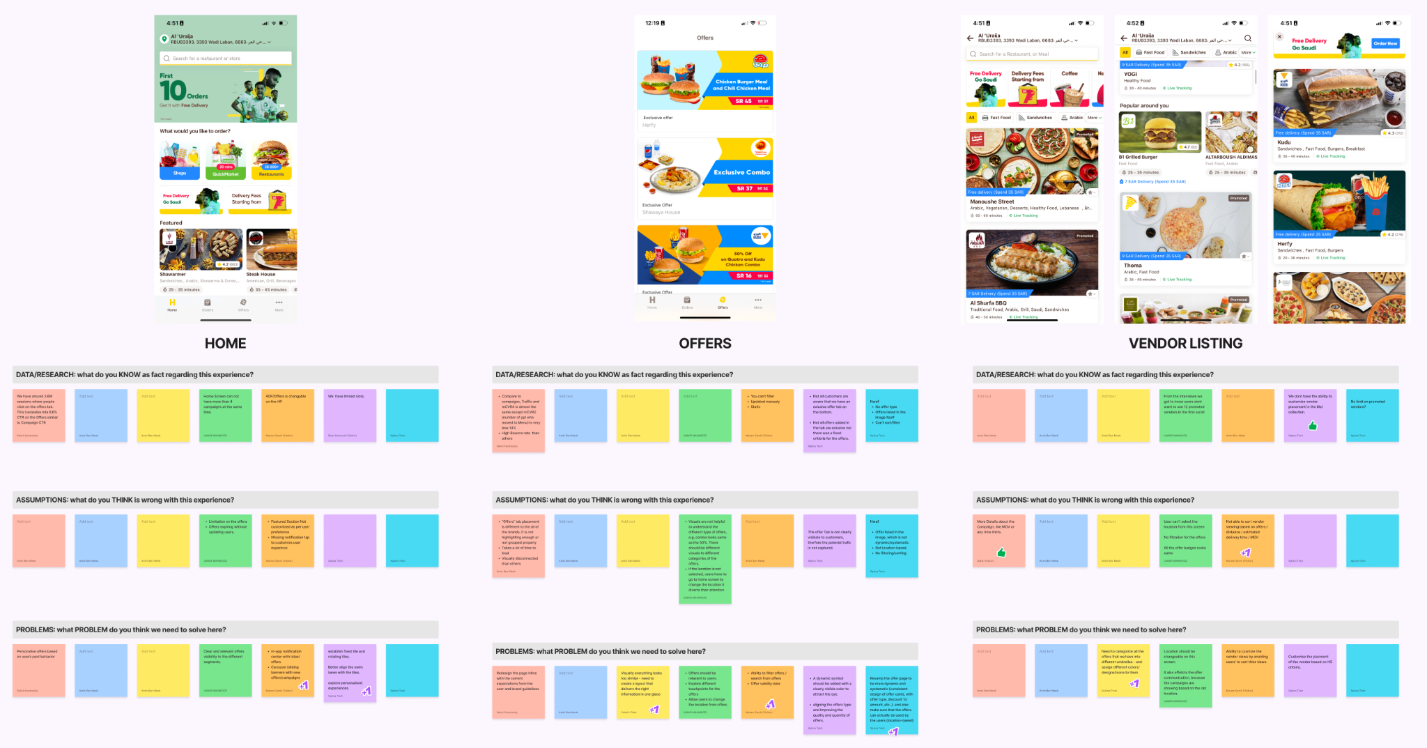
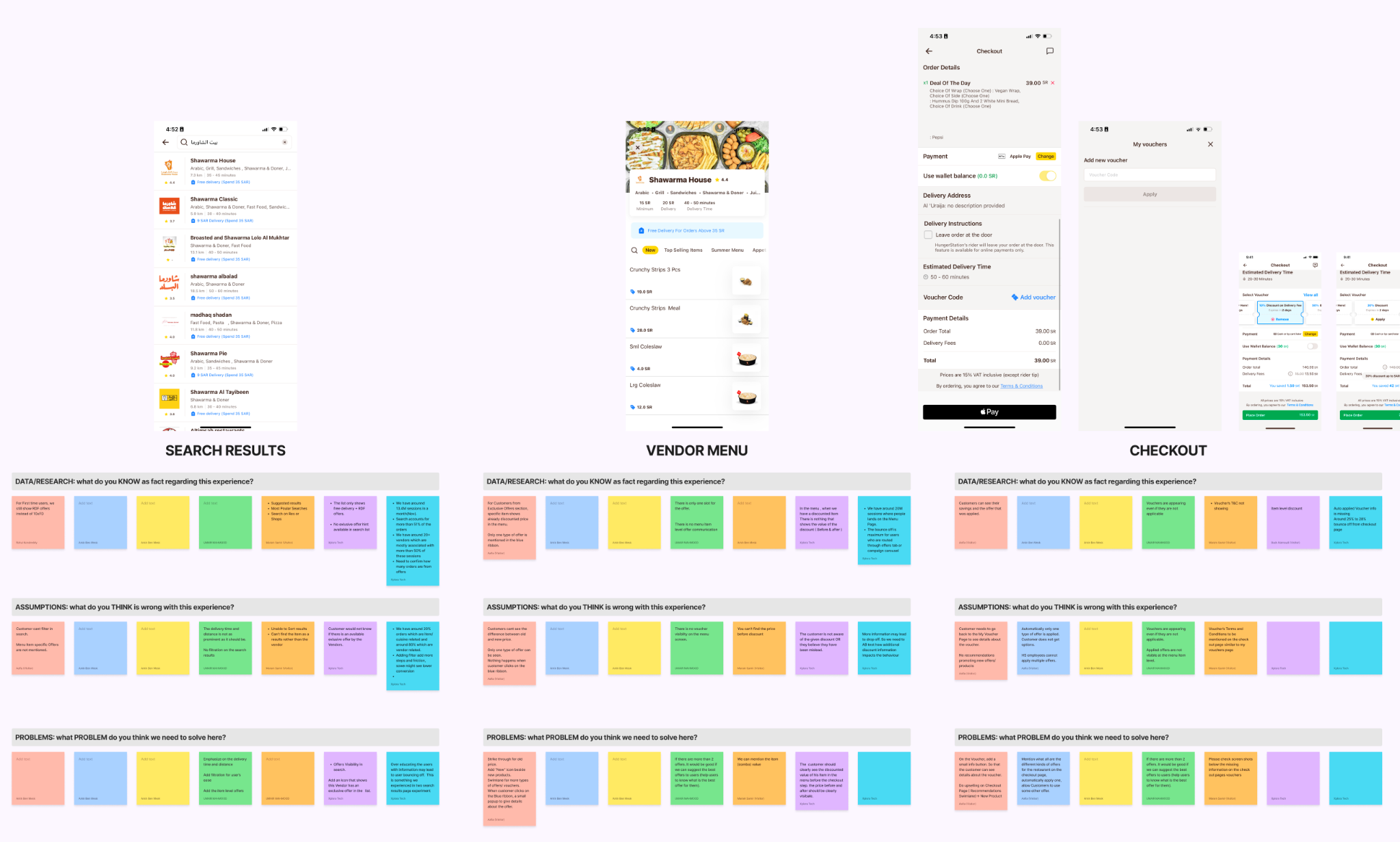
We ran 2 discovery workshops with 6 stakeholders across Product, Design, Trade Marketing, Tech, Analytics & CX. The goal: understand in-app offer-communication limitations, the ideal experience for each screen, existing data & research, assumptions, & problem framing.
 s15_approach_1.png
 s15_approach_2.png
Rather than redesign screens in isolation, we designed reusable components that could be injected into any area of the app - bringing consistency & simplifying the experience wherever offers appear.
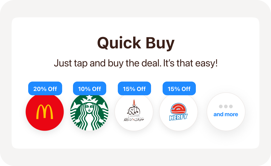
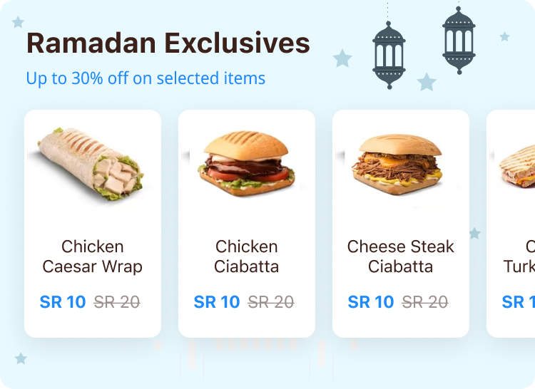
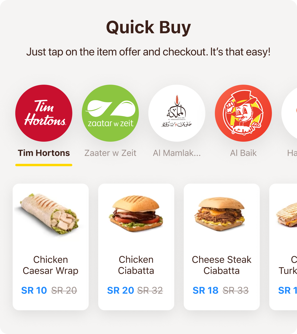
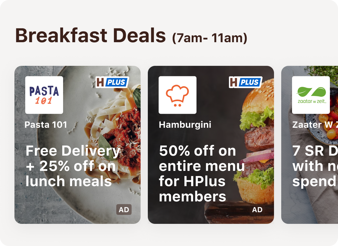
9 offer-focused components: Quick Buy (combo & item-level deals) · Happy Hours Swimlane · Campaign Theme Swimlanes (restaurant + item level) · Compact Swimlane for Vendor Menu · Exclusive on HungerStation · Awareness Strip · Mini Awareness Banner · Combo Deals · Upsell on Basket (discounted or free items).
 s16_approach_1.png
 s16_approach_2.png
 s16_approach_3.png
 s16_approach_4.png
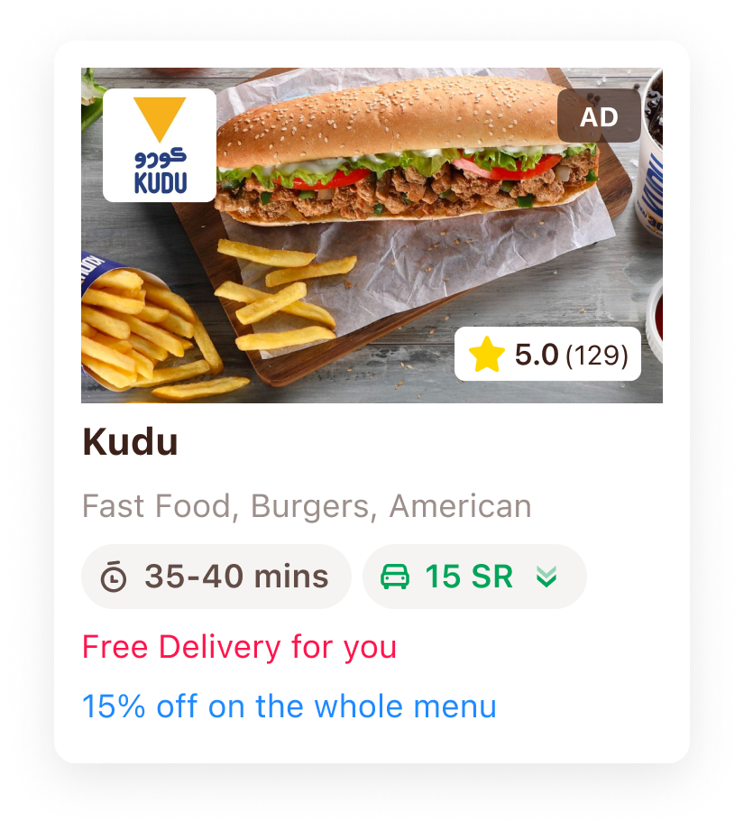
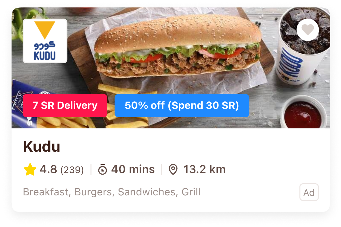
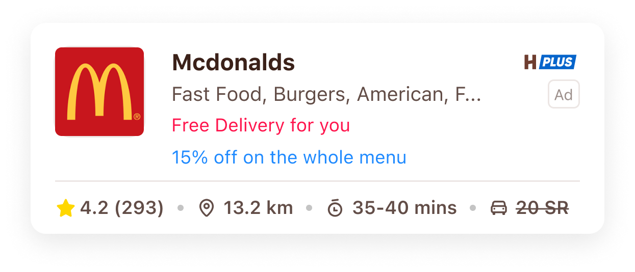
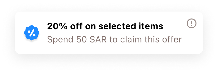
Two distinct colours used consistently across incentive banners, cards & icons. Red is dedicated to delivery-related offers, applied to core UI elements like delivery icons & labels. Blue is dedicated to every other offer type. Distinct colours per category help customers scan restaurants quickly. (Colours planned for A/B testing per offer category.)
 s17_approach_1.png
 s17_approach_2.png
 s17_approach_3.png
 s17_approach_4.png
 s17_approach_5.png
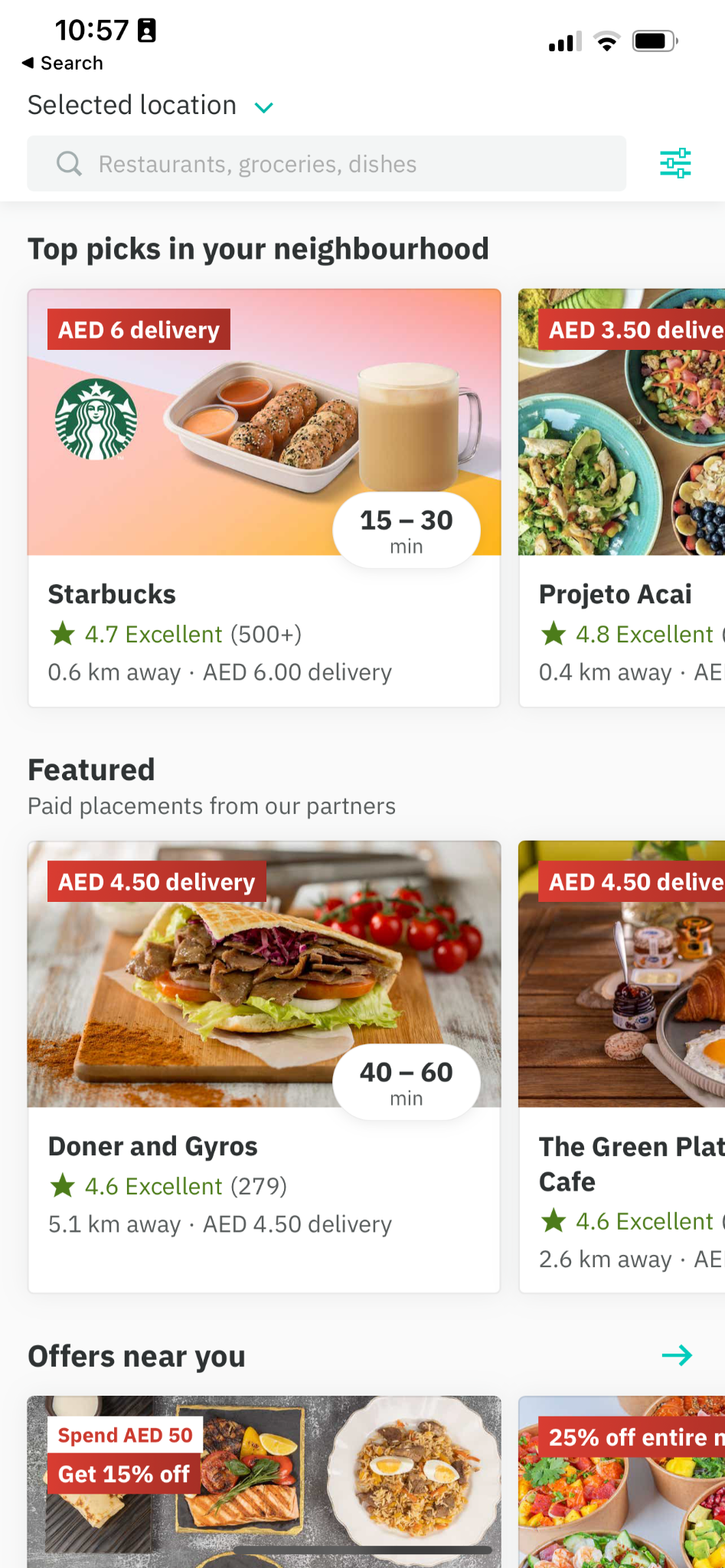
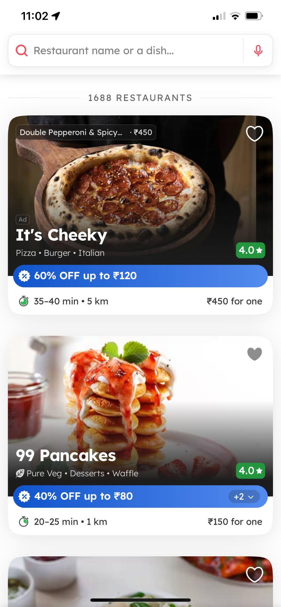
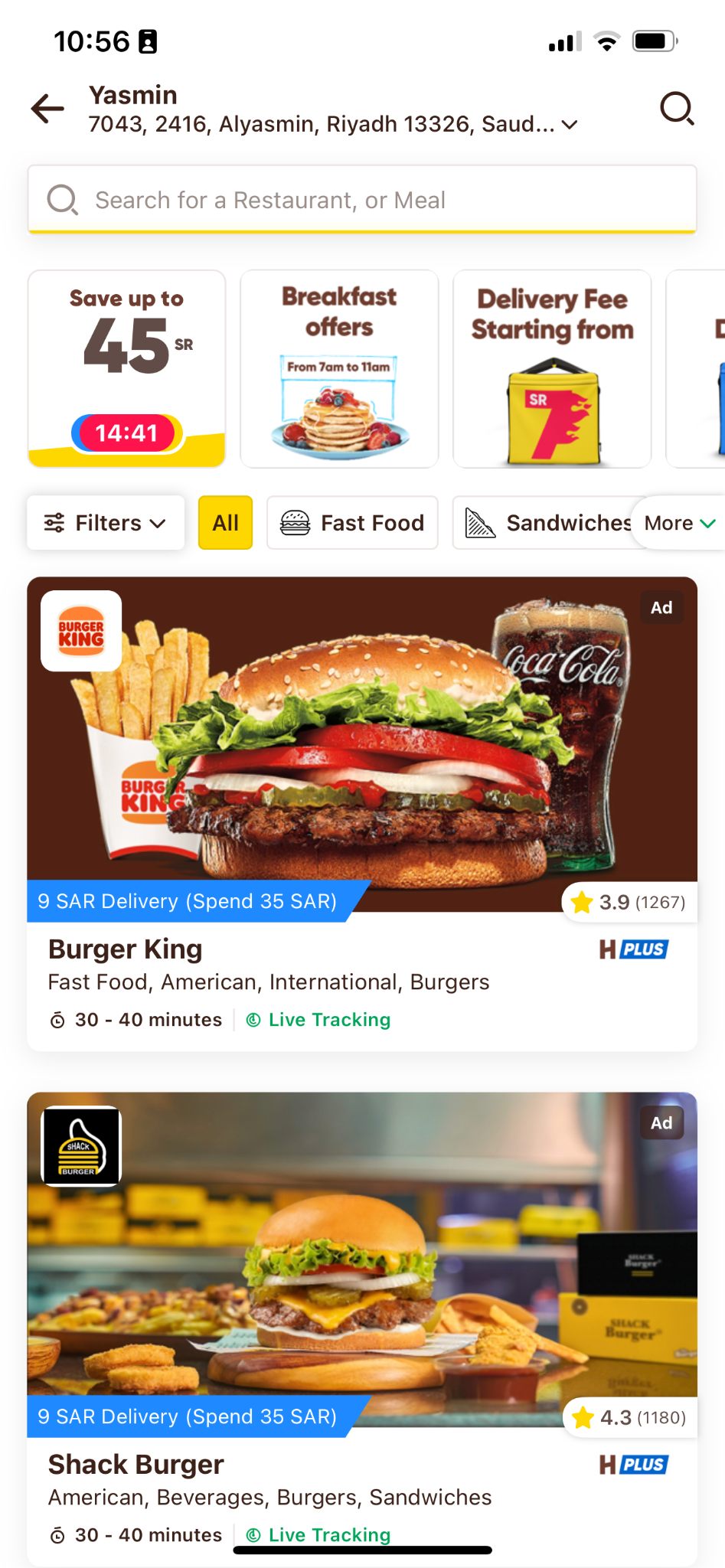
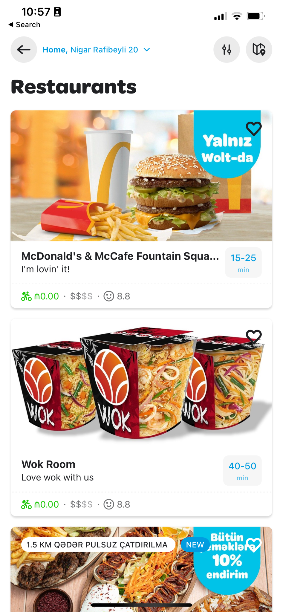
Campaigns need more detail (MOV, time limits); all offer badges look the same; offers need categorising with distinct colours/icons for easy scanning; some customers prefer a list view (referencing Jahez); delivery time & fee matter more than cuisine.
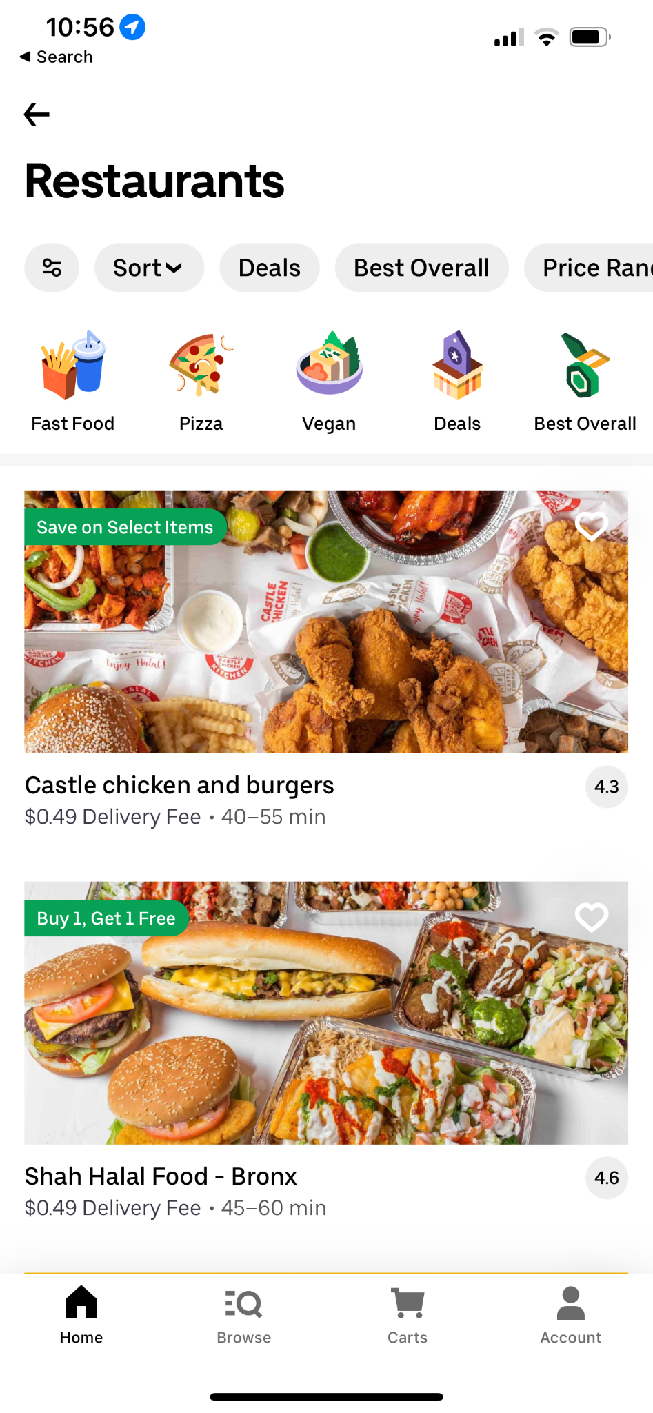
Customers can't see more than one offer per vendor card; card information is scattered; collections are the only route to offers; delivery & discount offers look identical; combo deals from the Offers page are invisible while browsing the listing.
How might we bring combo deals from the Offers screen into the vendor listing? Give exposure when a vendor has more than one offer? Surface offers beyond collections?
 s20_vendor-listing_1.png
 s20_vendor-listing_2.png
 s20_vendor-listing_3.png
 s20_vendor-listing_4.png
 s20_vendor-listing_5.png
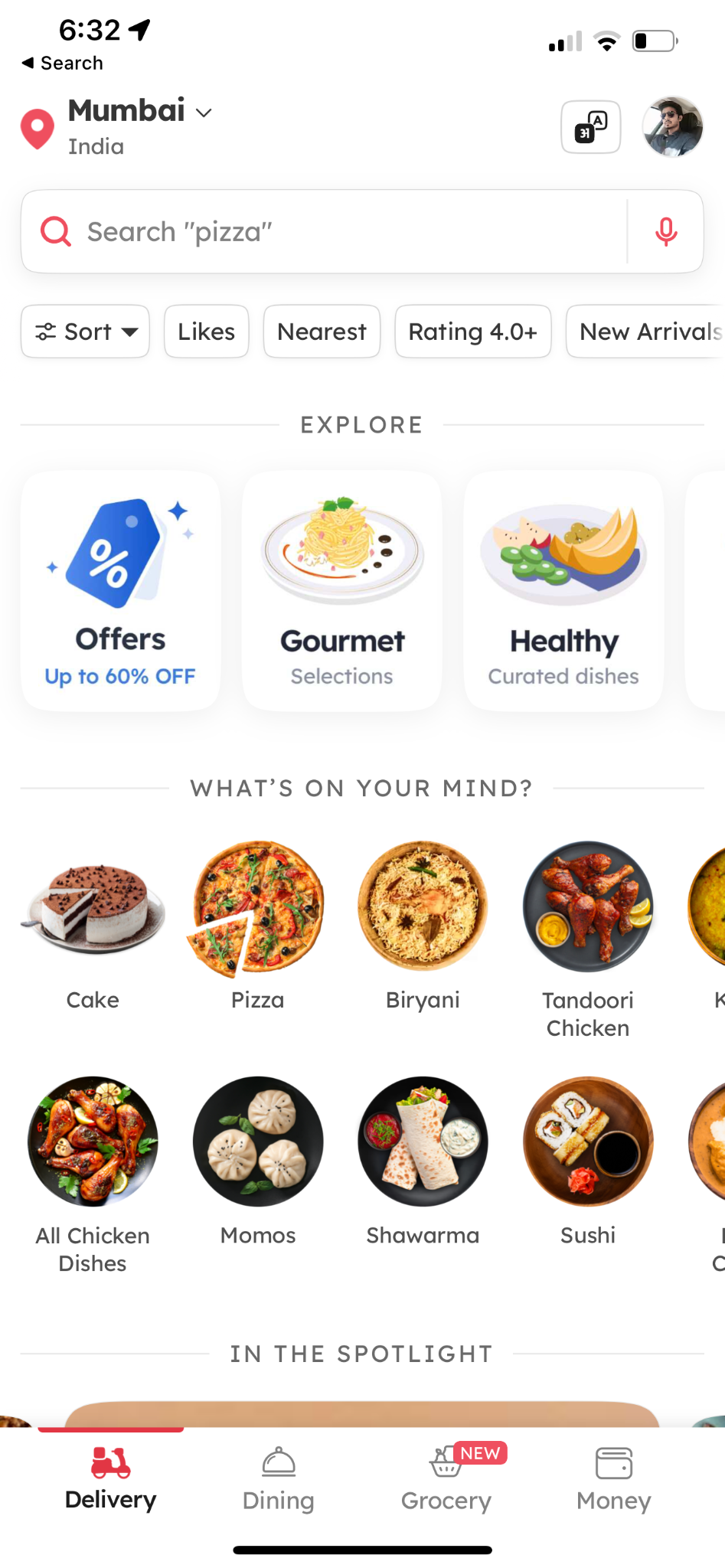
Common pattern: customers can see more than one offer per vendor card - Zomato shows more than two.
A dynamic component that clubs all combo offers together. Customers start browsing from the vendor listing without visiting menu pages, see multiple restaurants in one tap, & select a combo from the flyout straight through to checkout.
A dynamic component that clubs all discounted items & surfaces them on the vendor listing, with strikethrough pricing & restaurant tabs to browse another restaurant's offers in one tap.
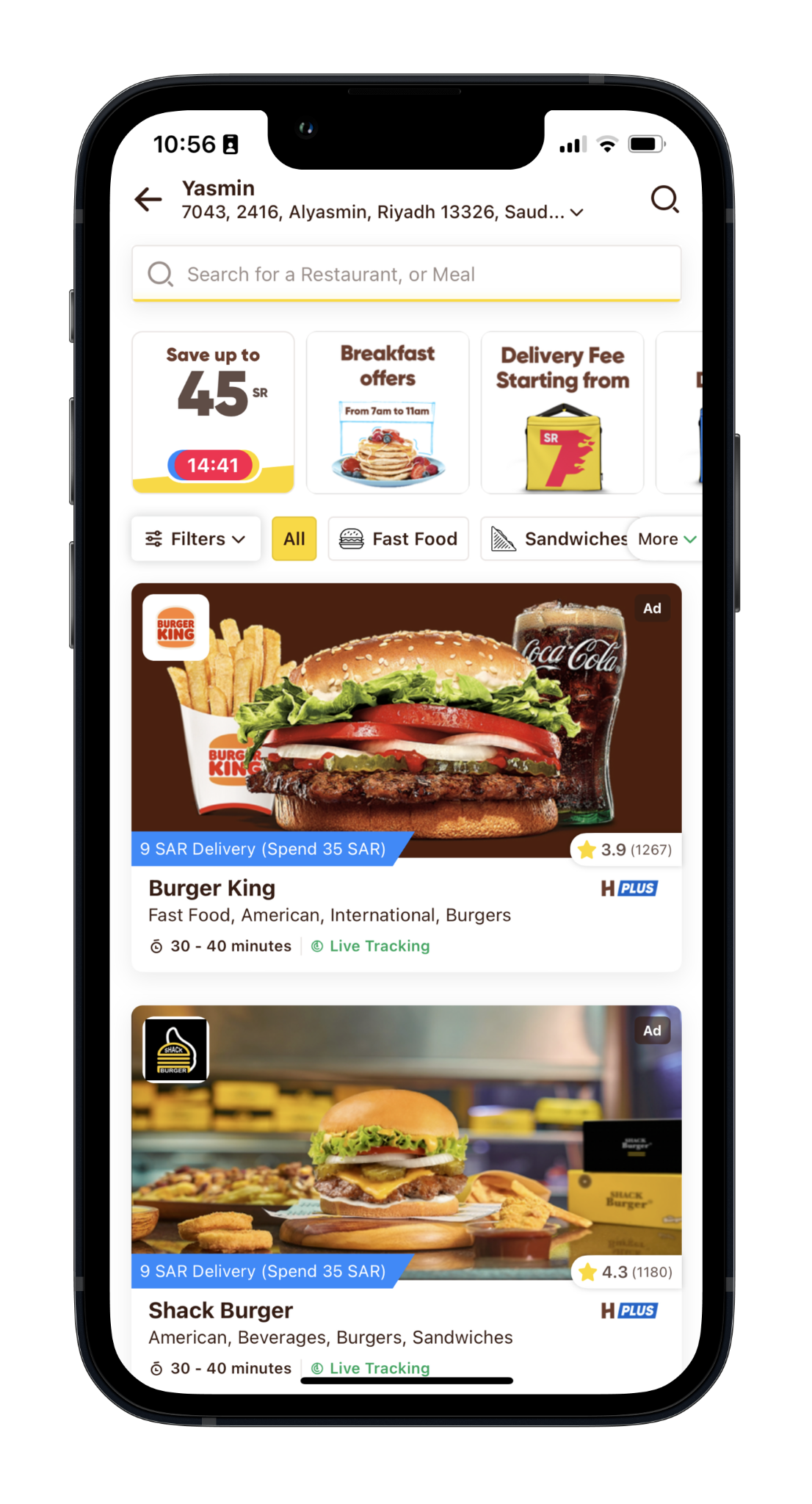
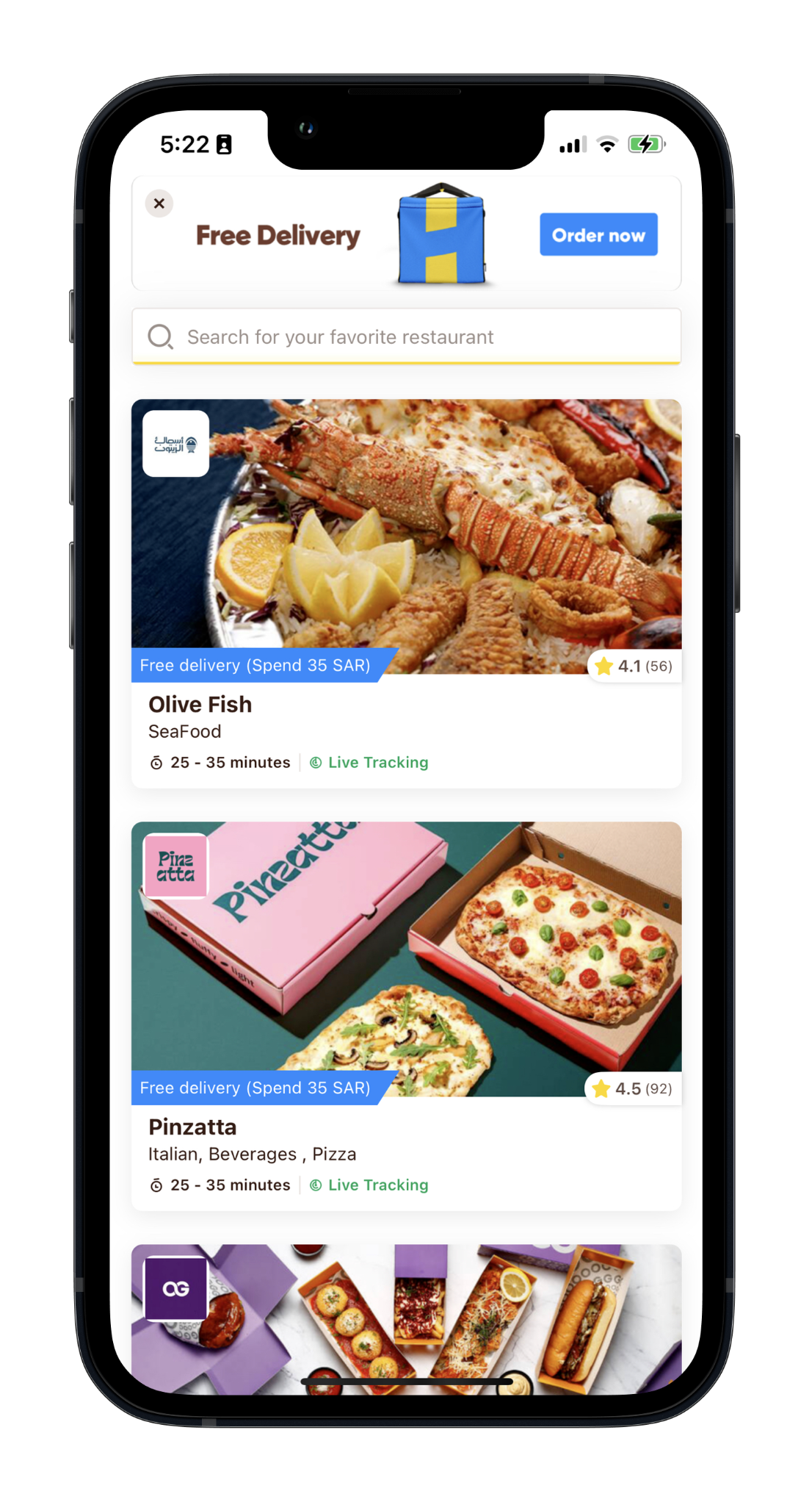
Information formatted like the new search-results design. Red for delivery-related offers, blue for everything else. More than one offer per card & list view, consistent with search results. Add-to-favourites & distance from customer.
 s24_vendor-listing_1.png
A clear header improves navigation between deals & gives space to display them attractively. An interactive campaign info-card summarises the essentials - expiry date & main conditions - opening an overlay with more detail on tap. The list shows only participating restaurants.
 s25_vendor-listing_1.png
Swimlanes featuring one type of deal with a link to the deal listing. Featuring a single deal type helps customers review offers faster, & stays traceable via a "see all" link.
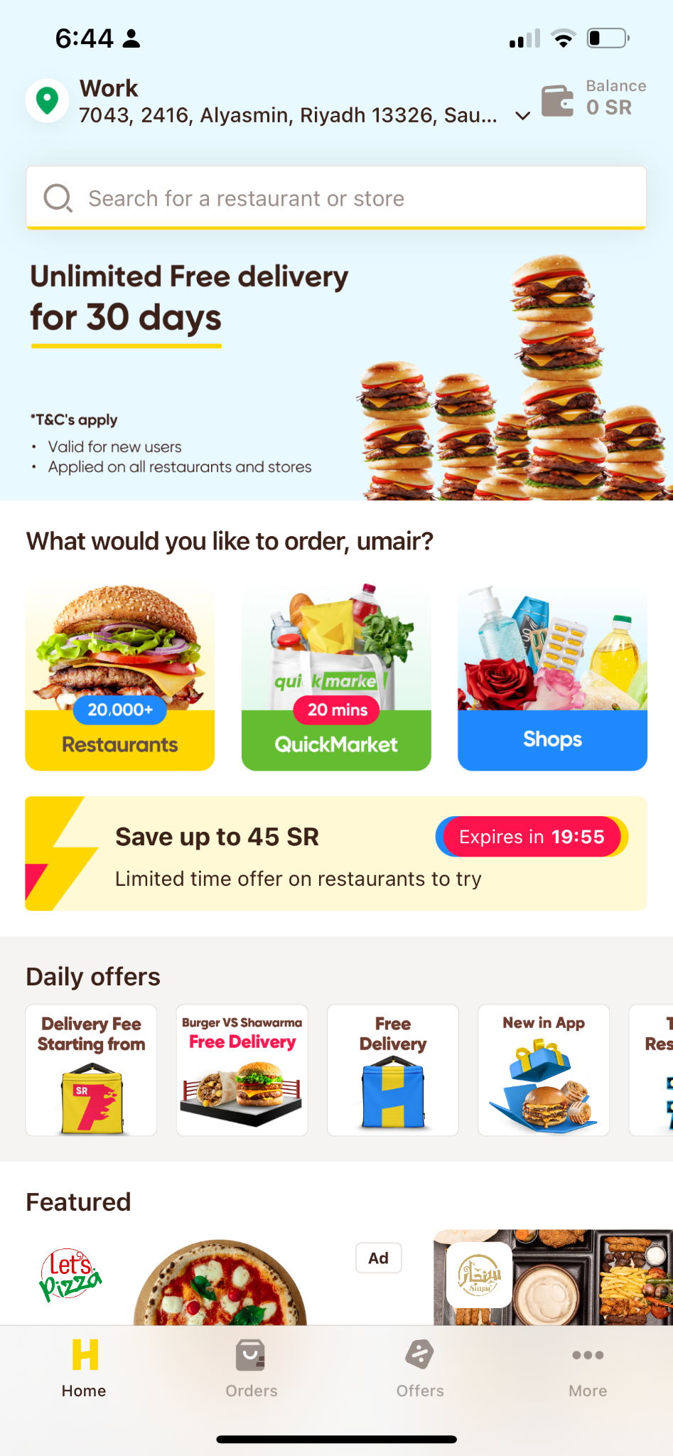
Personalise offers (a new customer shouldn't see a delivery fee); happy-hour deals lack attention; customers can't tell when offers expire; there's no place to find notifications; users see the 30-day free-delivery banner even on the last day of the offer.
New customers don't know their remaining free-delivery days; no clarity on campaign expiry; free-delivery customers still see delivery offers; customers struggle to find a push-notification offer again later.
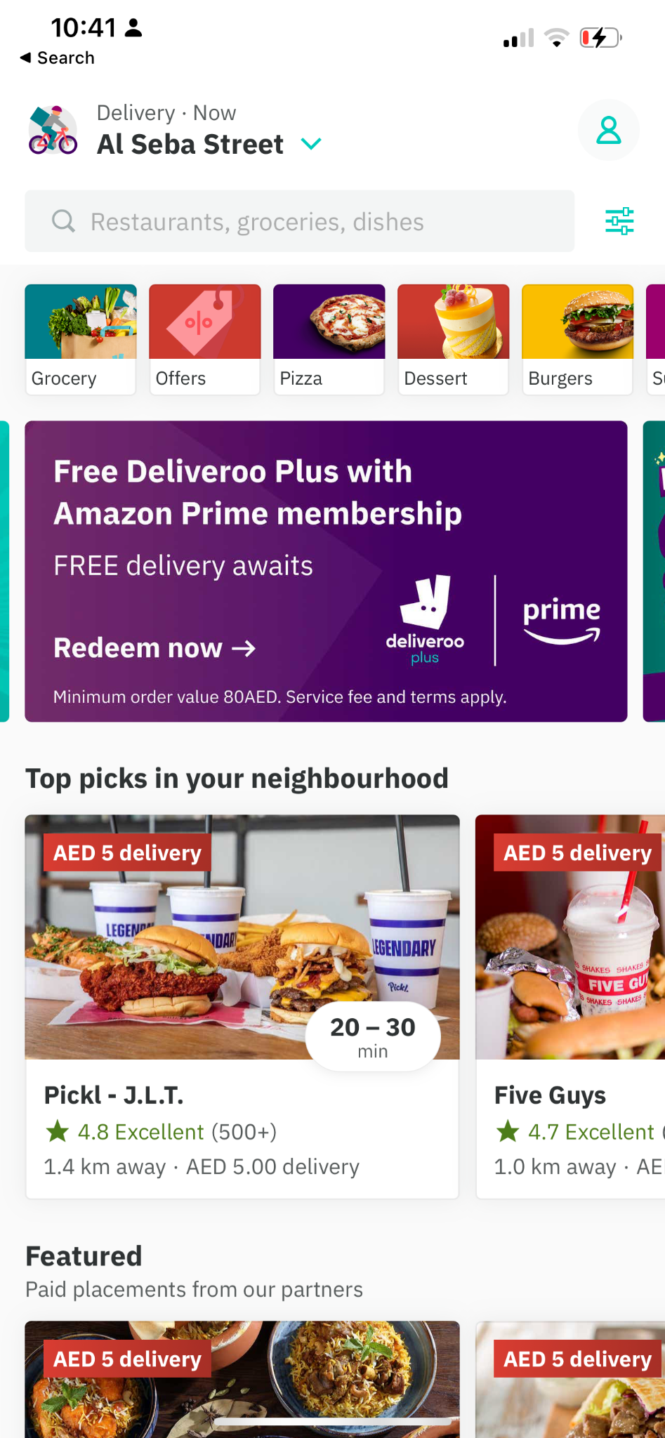
How might we improve the home screen to clearly communicate available offers, & give relevant offer experiences to new & existing customers?
 s30_home_1.png
 s30_home_2.png
 s30_home_3.jpg
 s30_home_4.png
 s30_home_5.png
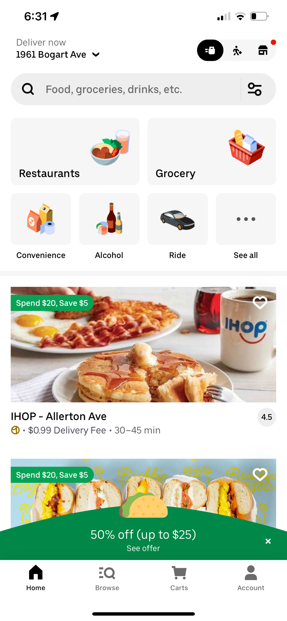
Common pattern: multiple swimlanes on the home screen, each showing one type of offer.
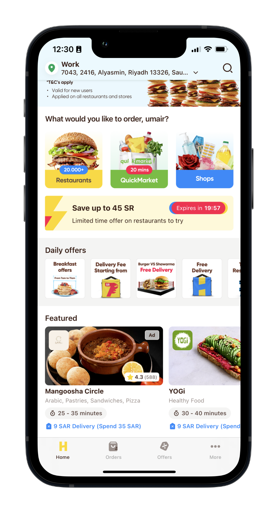
Displays happy-hour restaurants on the home screen, with clear Breakfast / Lunch / Dinner indicators & time slots. The component can be switched on & off by time, carry per-restaurant timers, & be injected across the app. Thumbnails can also be used for CPC.
 s32_home_1.png
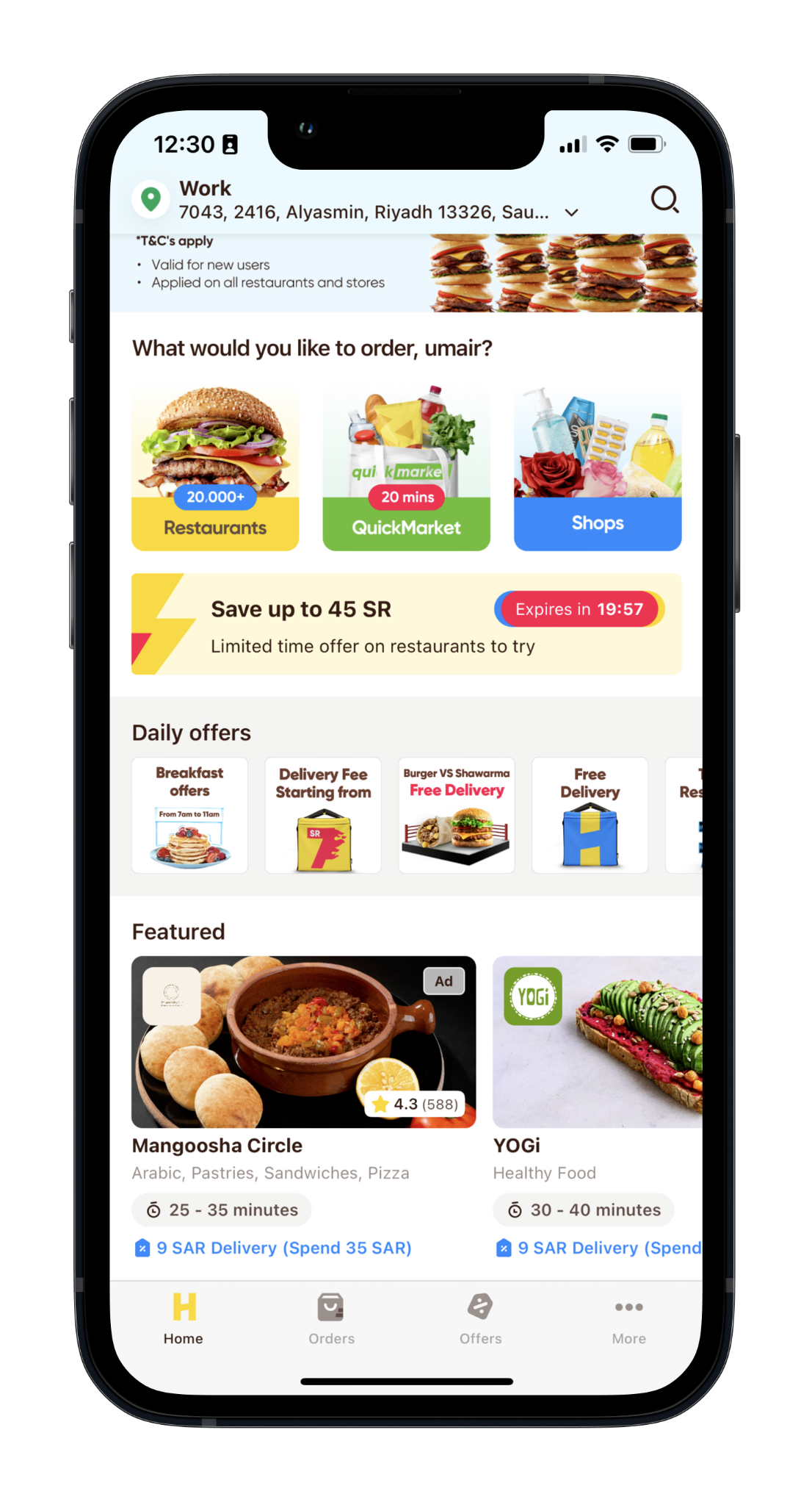
A dynamic component replacing inconsistent PNG assets. Current assets suffered inconsistent font sizes & placement, inconsistent image placement, & borders that weren't sharp on all devices.
 s33_home_1.png
 s33_home_2.png
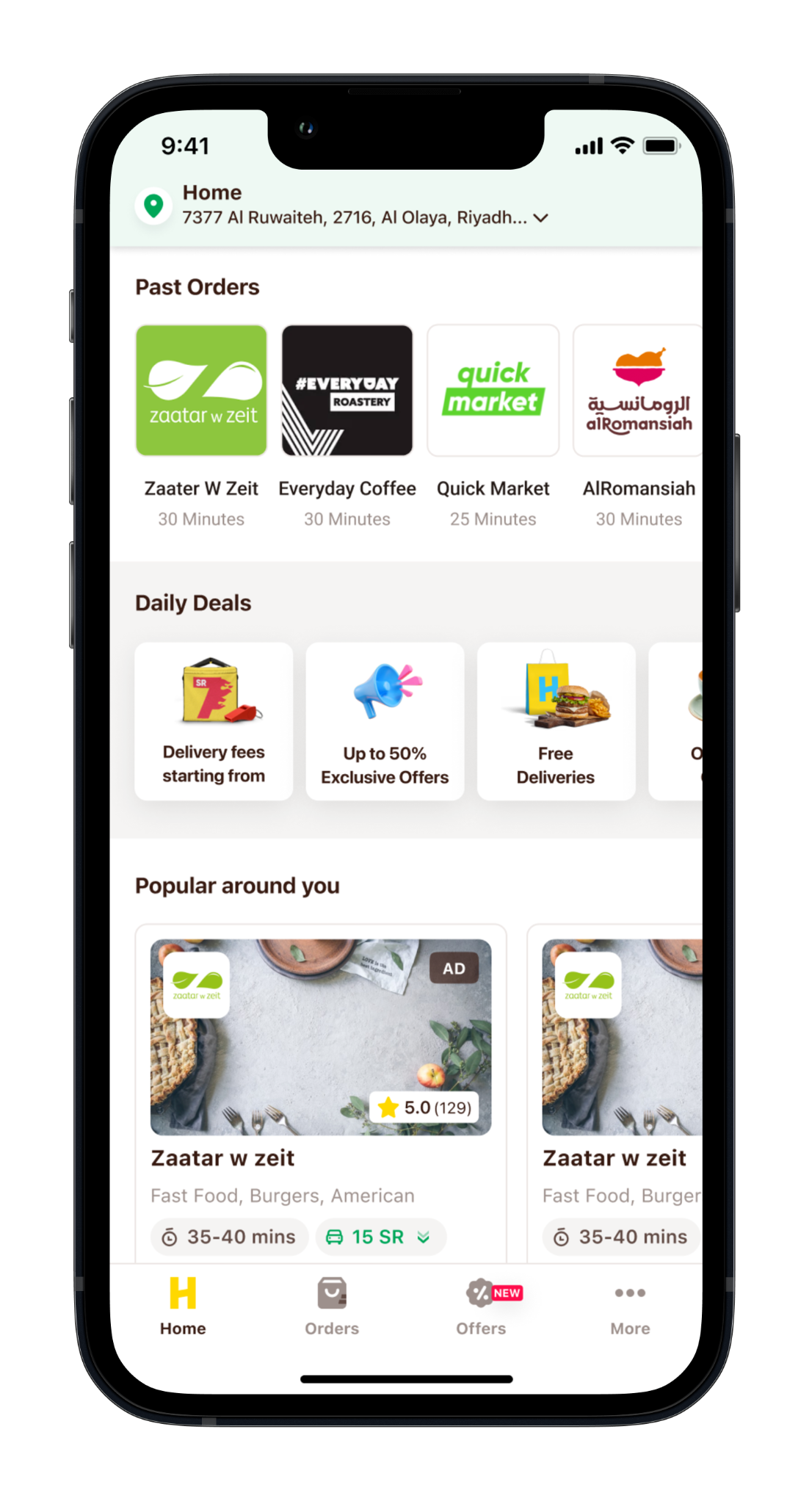
A text-based awareness strip injectable into different areas of the app. Home-screen use cases: 30-day free-delivery counter for new customers, savings from free deliveries, savings from offers, HPlus renewal reminder.
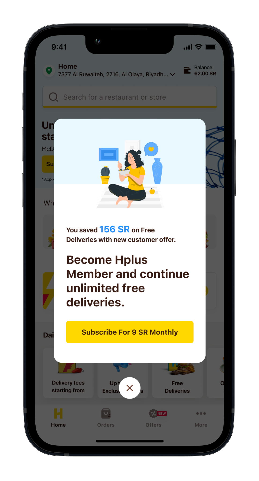
Upsells HPlus after a new customer completes their 30-day free-delivery offer, highlighting the savings from free deliveries. The CTA takes users straight to the HPlus membership page.
 s35_home.png
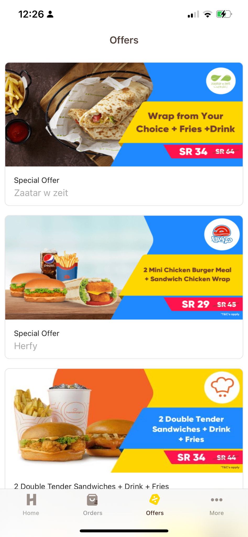
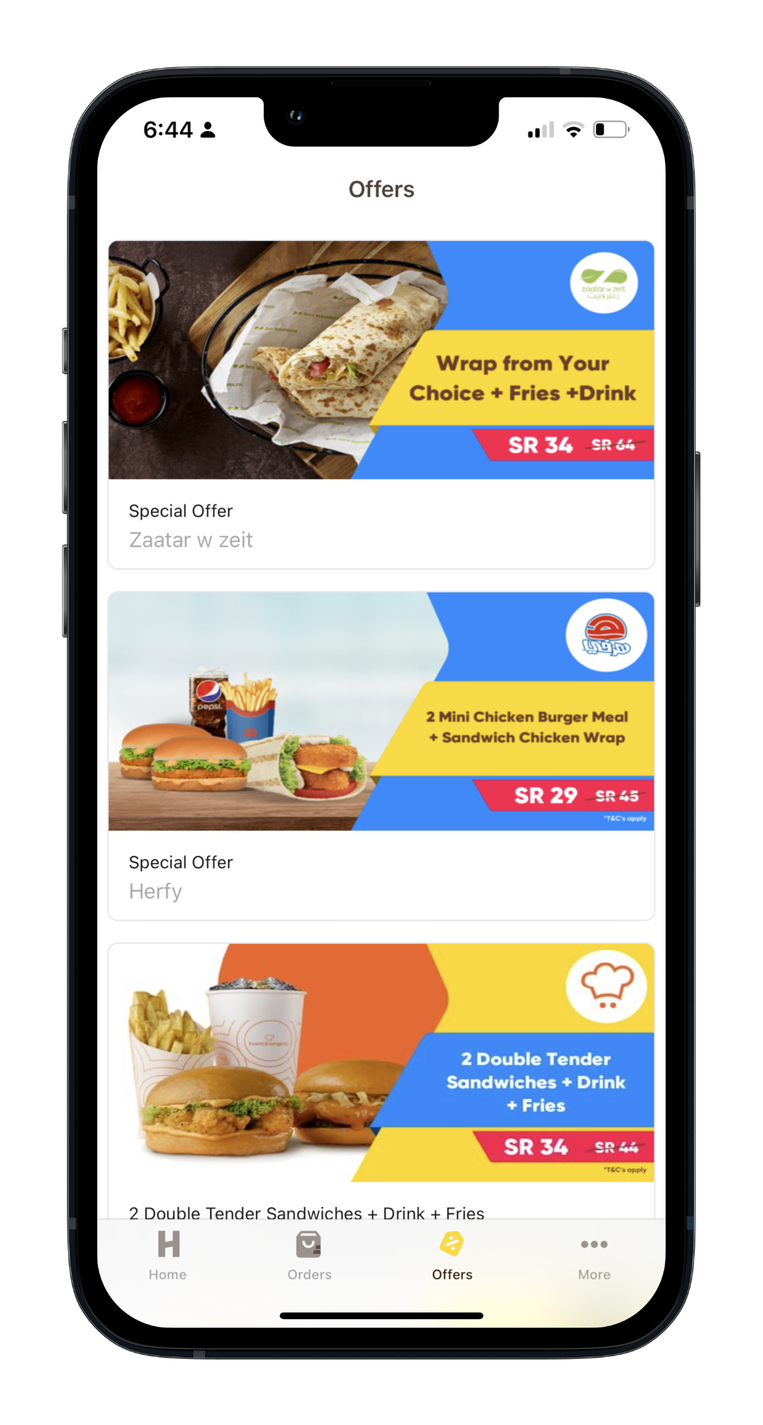
No ability to customise vendor placement in a tile/collection; higher bounce rate than other campaigns; from the Offers tab, around 14% (Offers mCVR2) of users who land progress to the menu page - a large gap versus other campaigns & a major opportunity.
No sort/filter (static); no fixed offer criteria; inconsistent "Offers" tab placement; visuals don't distinguish offer types (a combo looks like a 50%); no location change from offers; offer validity needs a clear dynamic marker; users should see every offer type here.
How might we make the Offers screen a single point for all offers, create ad opportunities for the sales team, & make it easy to find the same offers on the menu screen?
 s39_offers_1.png
 s39_offers_2.png
 s39_offers_3.jpg
 s39_offers_4.png
 s39_offers_5.png
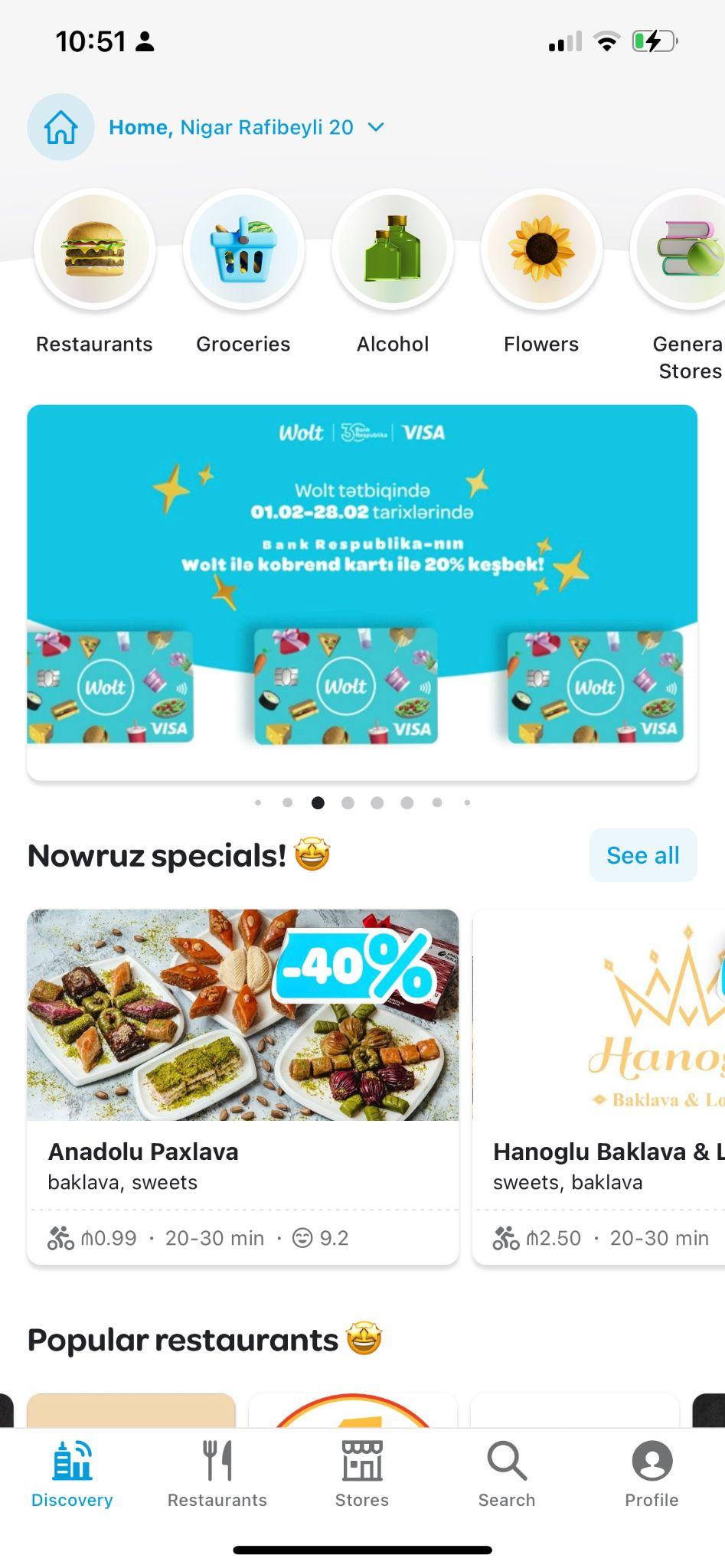
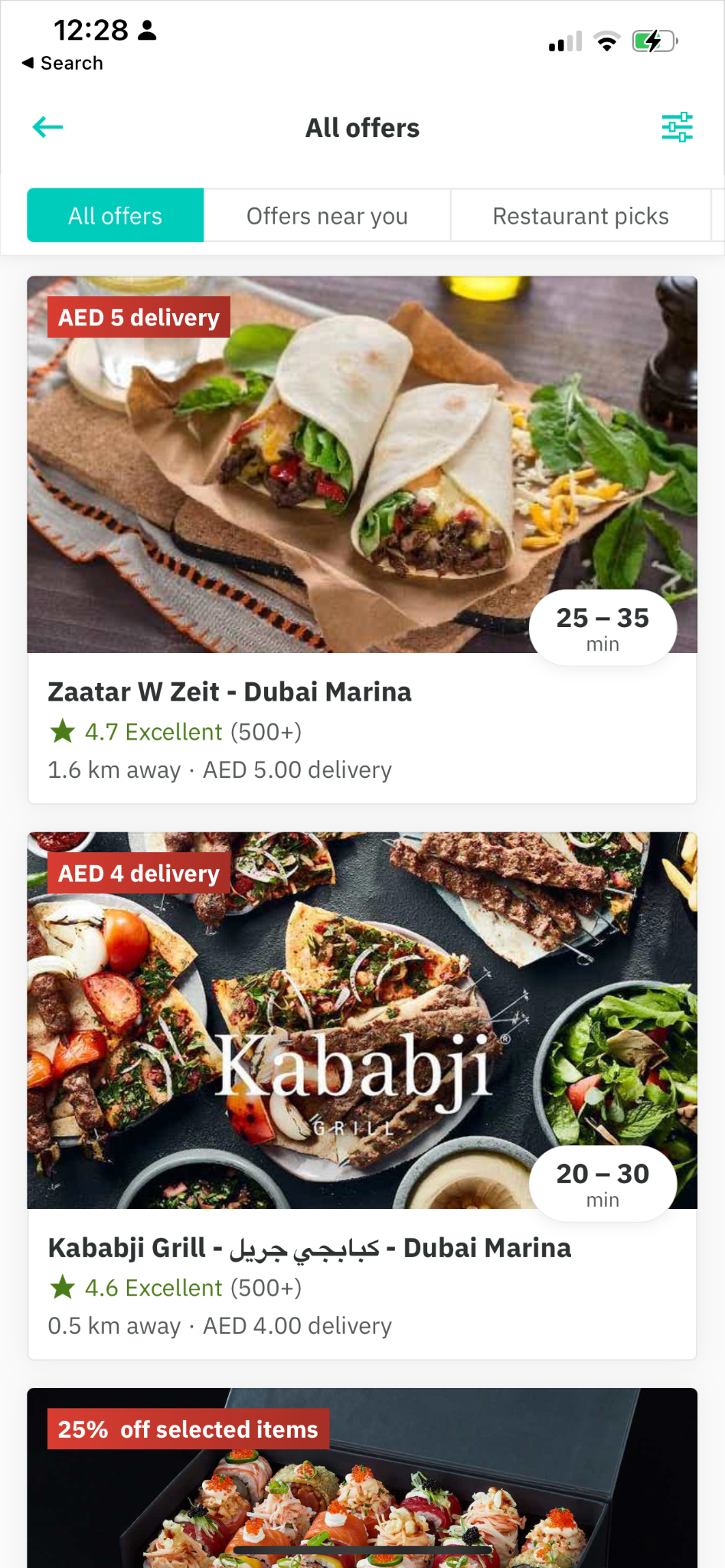
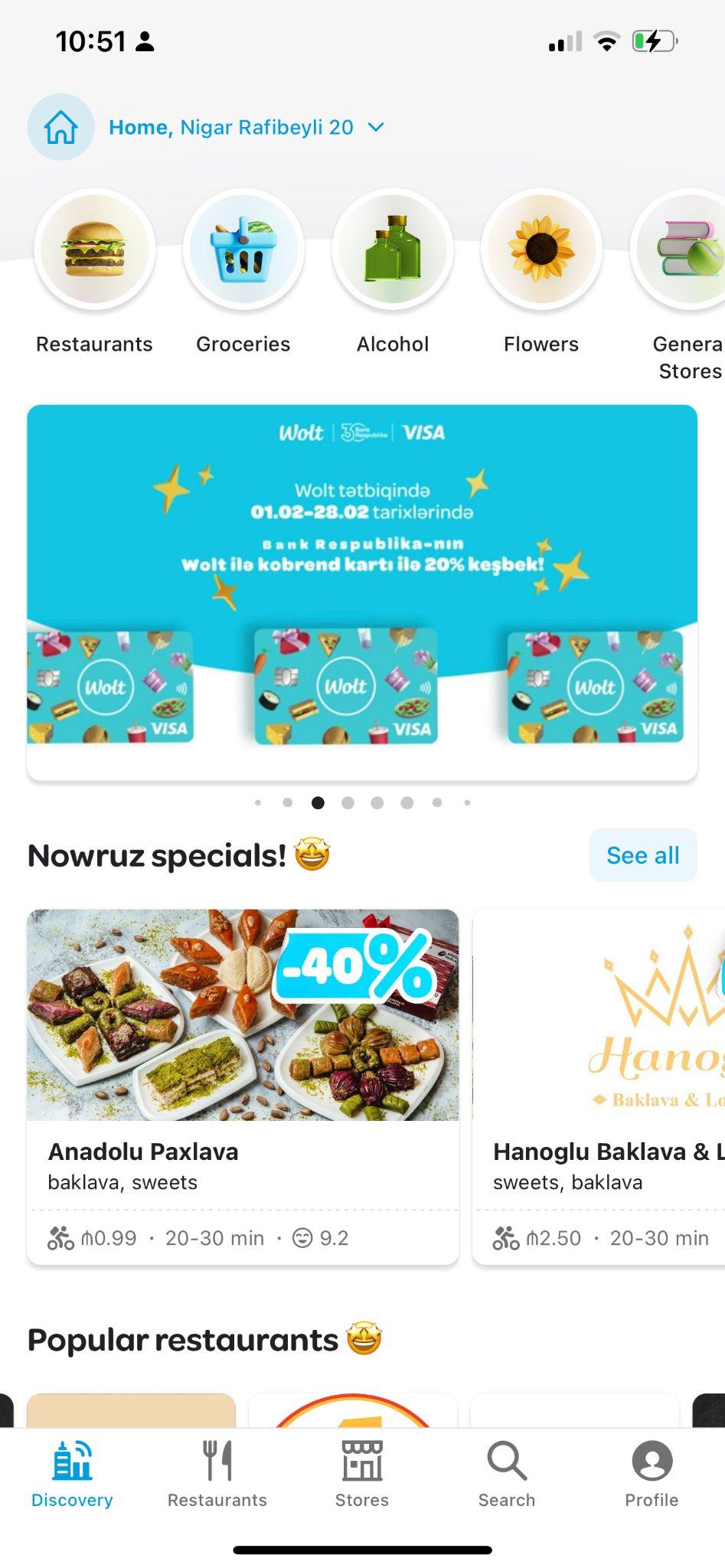
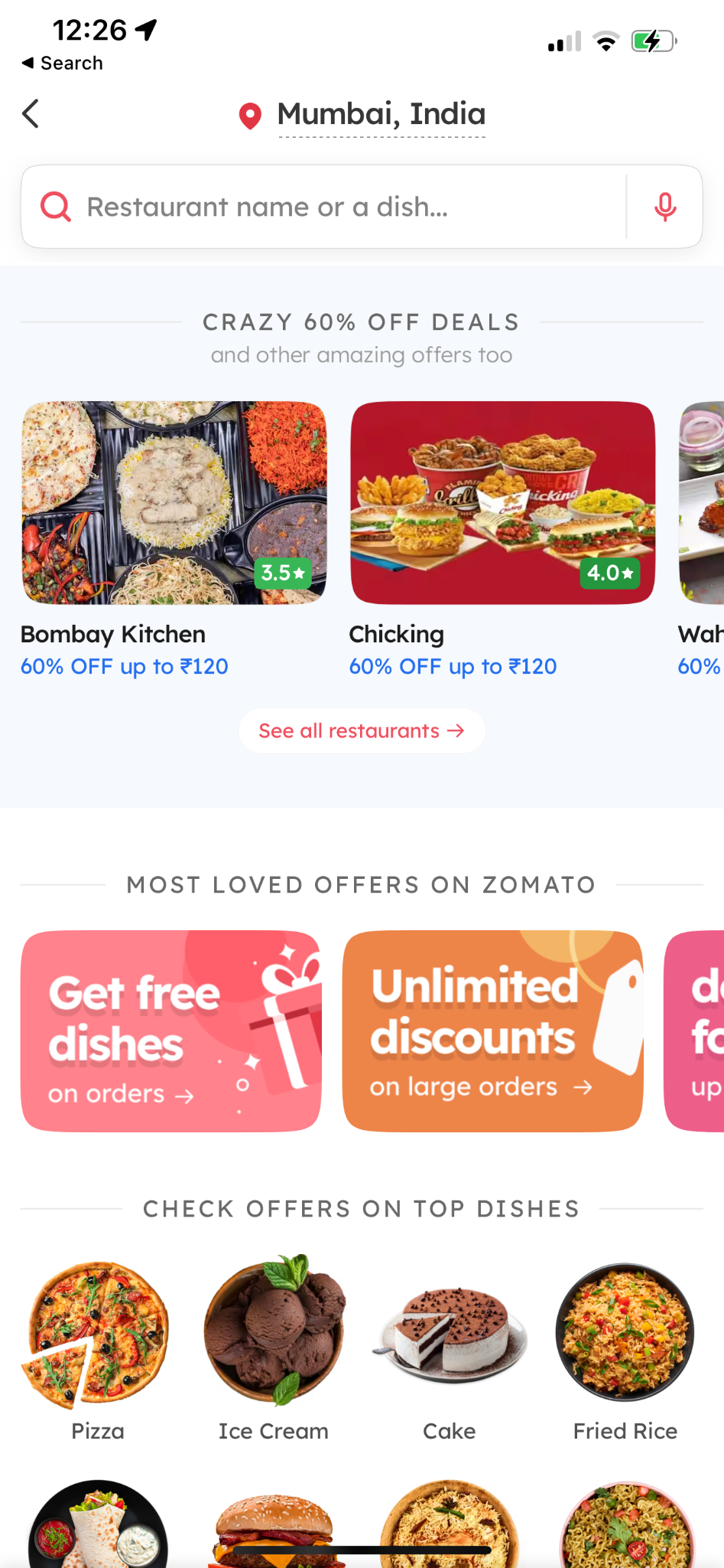
Common pattern: every app lets users browse all available offers on one screen - Wolt uses its home screen to showcase every offer.
A dedicated component for exclusive offers only, always positioned at the top of the screen, with vendor branding customisation & time-based offers. Tapping a restaurant opens its menu page.
A happy-hours component with individual offer times - each restaurant carries its own expiry date & time. Usable for CPC with an image or video background.
A dynamic component with clear information on what's included in the combo, strikethrough pricing, & a consistent layout for readability across all offer cards. Tapping a card opens the menu page scrolled to the offer listing.
 s43_offers_1.png
Every available offer listed on the Offers screen, filterable by cuisine, distance, rating & offer type (delivery / free-time / discount). Tapping a card opens the menu page scrolled to the offer listing.
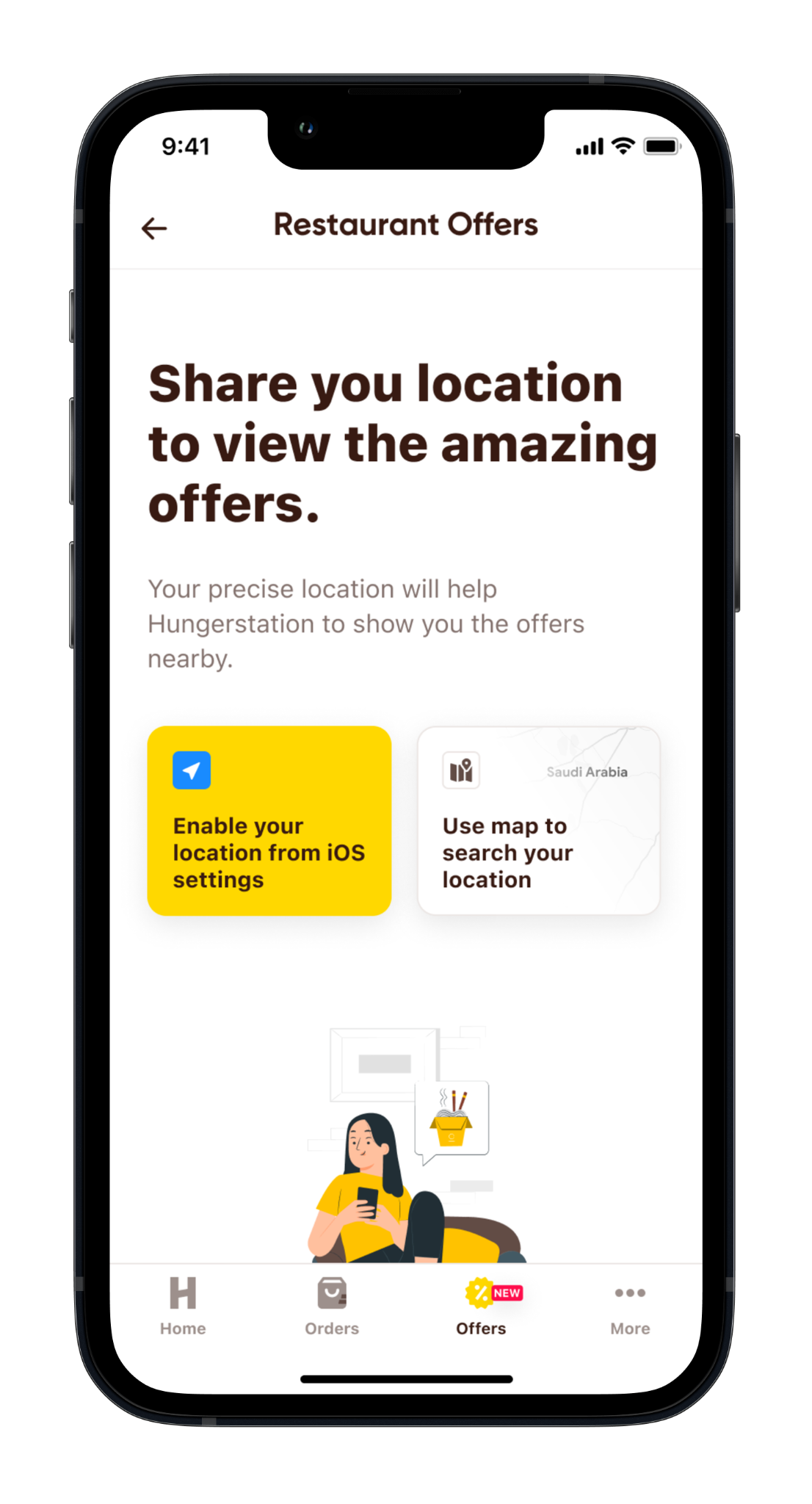
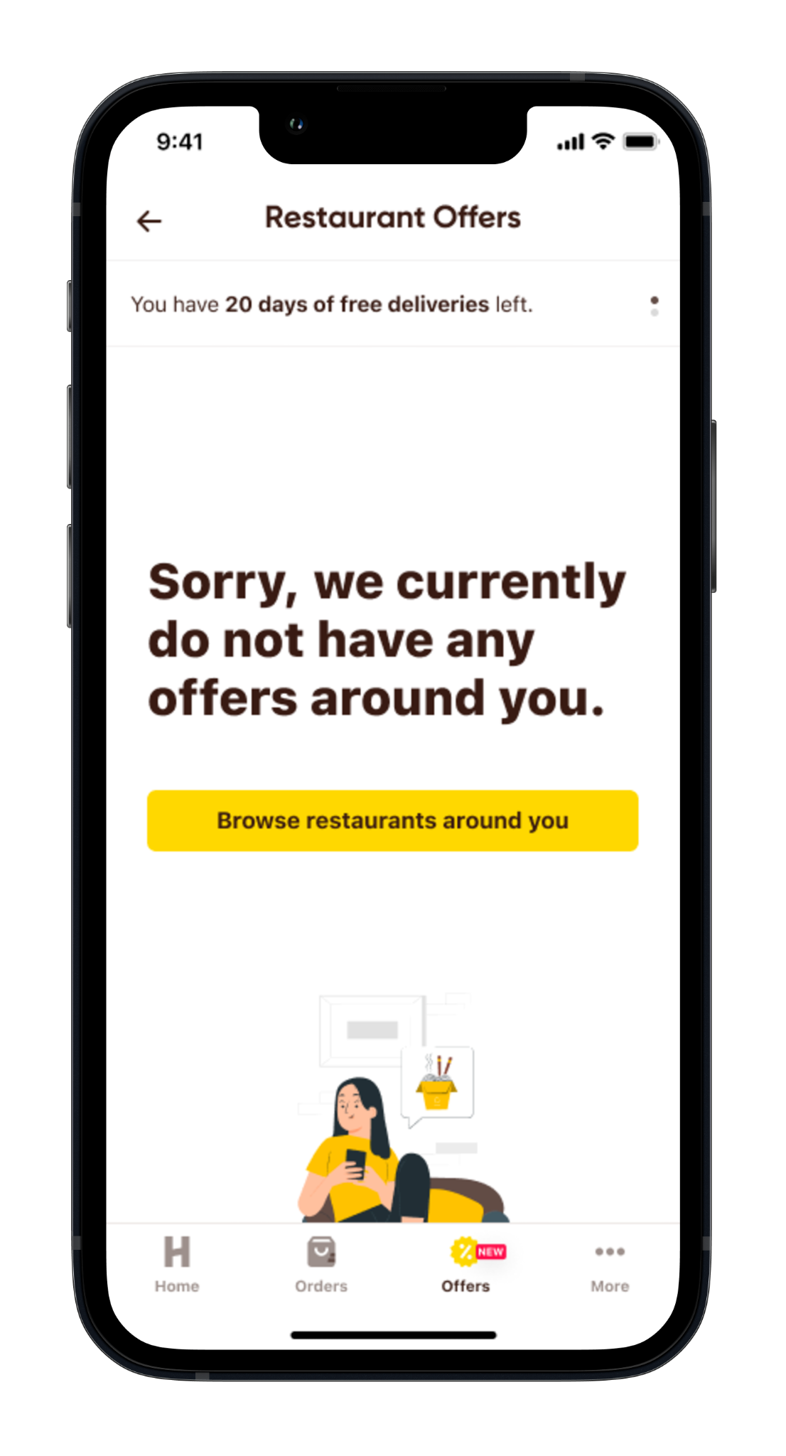
Prompts to browse the Offers screen & to select a location from it, plus a zero-offer-available state that encourages new & existing users to browse offers.
 s45_offers_2.png
 s45_offers_3.png
Highest bounce for users routed via the Offers tab or campaign carousel; no menu-item-level offer communication; discounted items don't show before/after value; only one offer type visible; no voucher visibility; a blue-ribbon offer needs a detail popup; customers should see the discounted value clearly before checkout.
Some vendors have more than one offer but only one can be shown; exclusive/discounted items look like normal items; combo discount prices aren't visible; combos are hard to find when arriving from the Offers screen.
How might we communicate all available offers on the vendor menu?
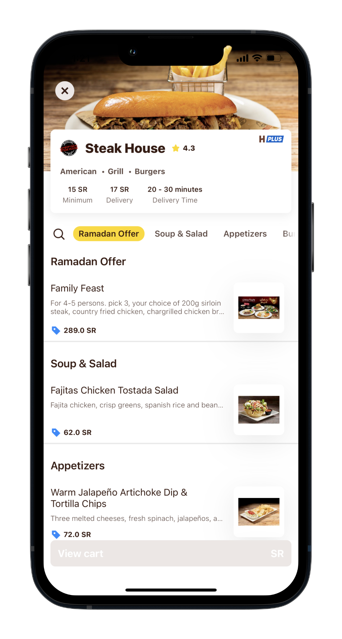
Restaurants with offers get a compact carousel listing everything available (Phase 2 will include vouchers). Tapping a card opens a detail overlay. Offers are categorised by icon - a red car for delivery (per the colour rule), a percentage for discounts, a card icon for bank offers.
Placed above all items for better visibility of selected item offers - an attractive way to showcase event-dedicated deals, with graphics that instantly communicate context.
 s50_menu_1.png
Clear information on what's included, strikethrough pricing, & a consistent layout for readability. Tapping a card opens the menu page scrolled to the offer listing.
First-time users still see RDF offers instead of 30-day free delivery; the list shows only free-delivery + RDF; no exclusive-offer hint; menu-item-specific offers not mentioned; add an icon showing a vendor has an exclusive offer.
Users can't filter/sort results, or filter by offers; can't see item-level offers or whether a restaurant has more than one; dish keywords still return restaurant-focused results.
How might we improve visibility of a restaurant's exclusive or selected-item offers?
An addition to the new search-results screen. Users see more than one offer; delivery offers in red text, other offers in blue.
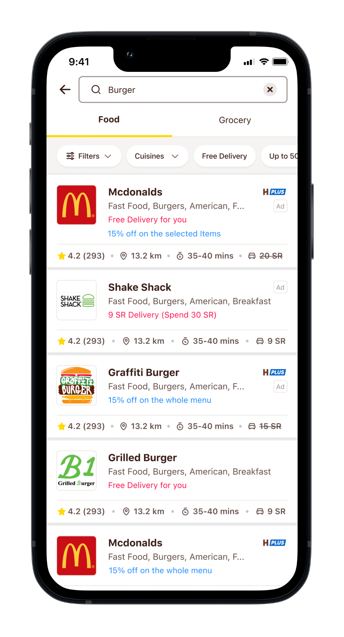 s56_search.png
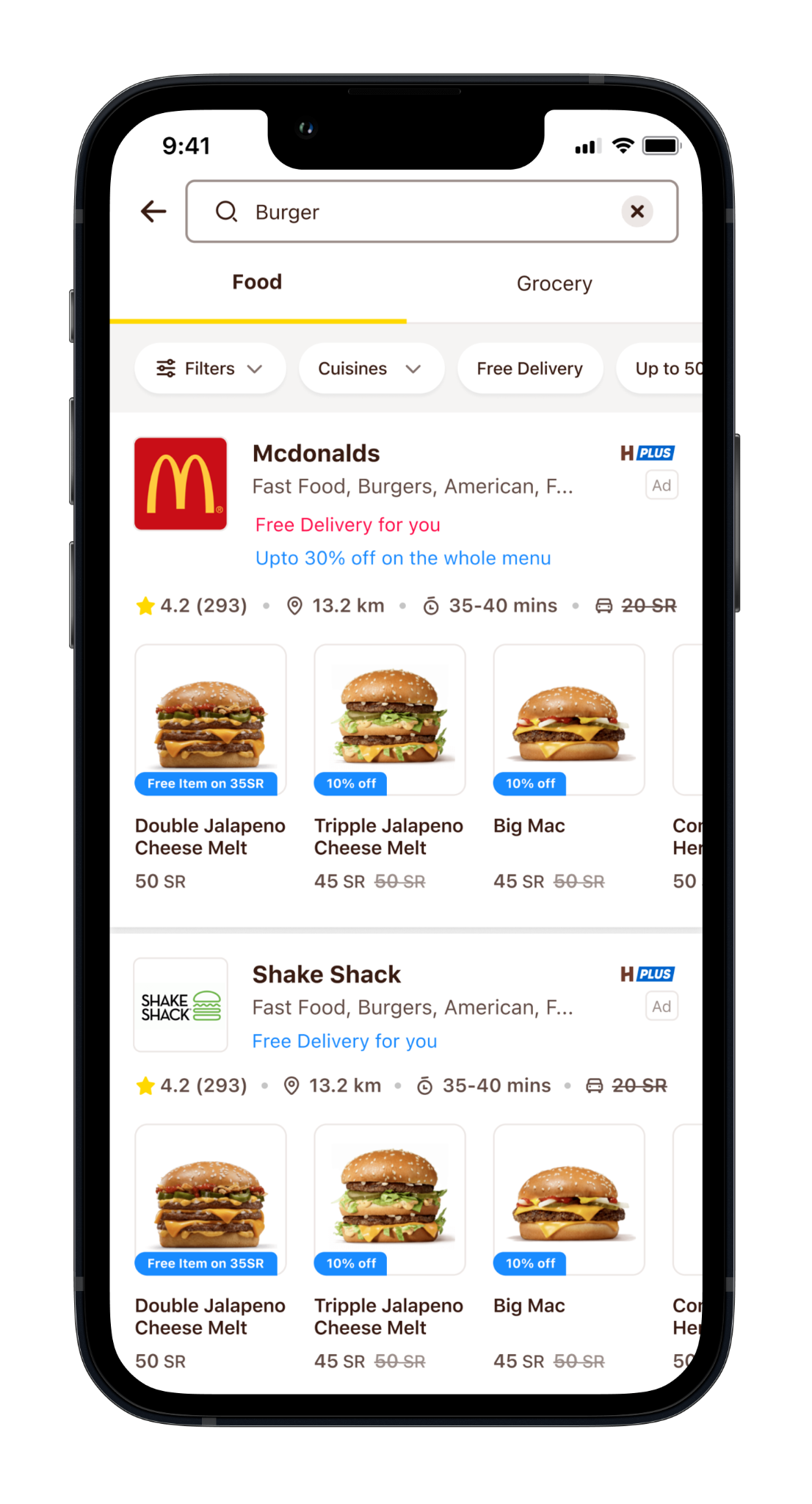
Attractive item search results with strikethrough pricing, discount items prioritised, & the same layout as the new search results. Users see more than one offer; delivery offers in red, others in blue.
 s57_search_1.png
 s57_search_2.png
Around 20% of searched keywords are dish-specific. Dish title becomes primary, restaurant name secondary; an offer shows when applied. Item-focused results omit ratings (unless item ratings are introduced).
3.5% of orders use "leave at the door"; rider-tipping CTR 3.5%; ~2% of orders carry notes; quantity can't be changed at checkout; no summarised view of address, payment method & breakdown; no cart recommendations; no standout for savings/discounts; no visibility of applicable promos; some users don't know they can add notes; many pay by Apple Pay & cards; checkout capabilities differ across shops, QM & restaurants.
Customers need a basket experience; the checkout information sequence needs reimagining (first scroll = essentials only); the screen is long & easy to miss details; customers want previously-ordered suggestions.
How might we improve the visibility of offers on the basket & checkout?
 s62_basket_2.png
 s62_basket_3.png
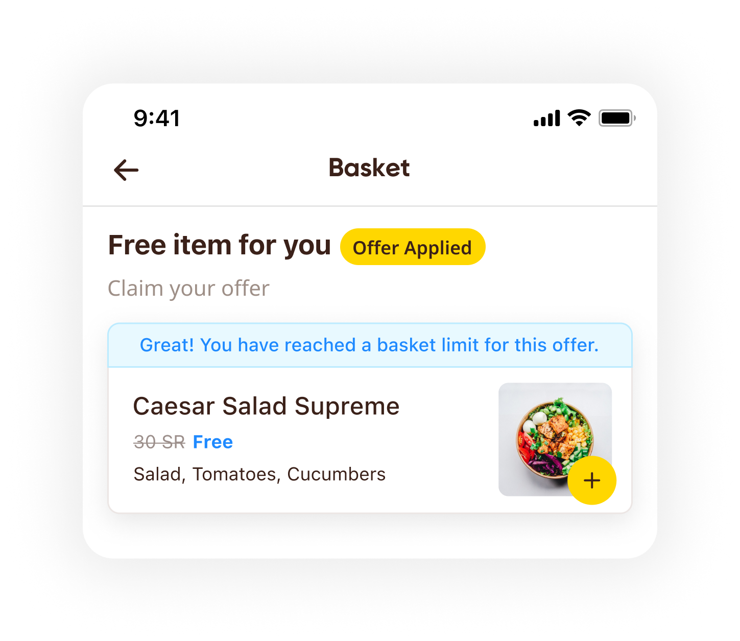
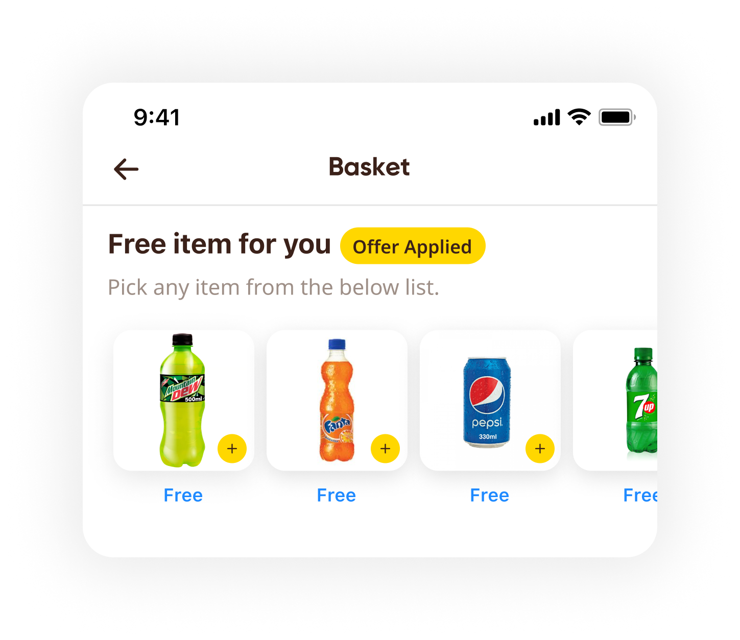
Lets customers add more items to the basket - & can also be used to claim a free-item offer, whether one free item or a choice of several.
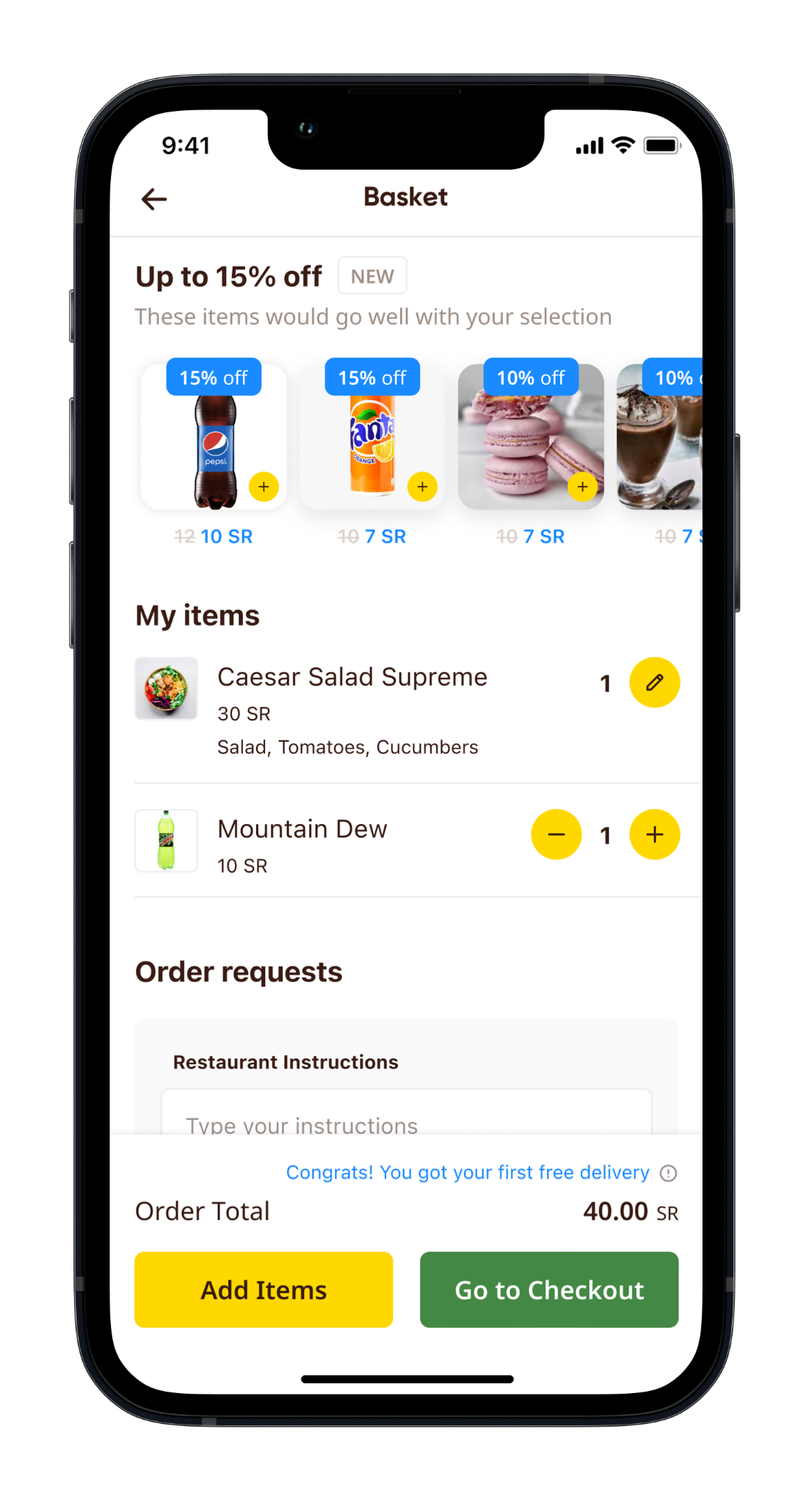 s62_basket_1.png
Communicates offers at the bottom bar before customers proceed to checkout, with a flyout for offer details - consistent with the campaign-listing & menu offers-carousel interactions.
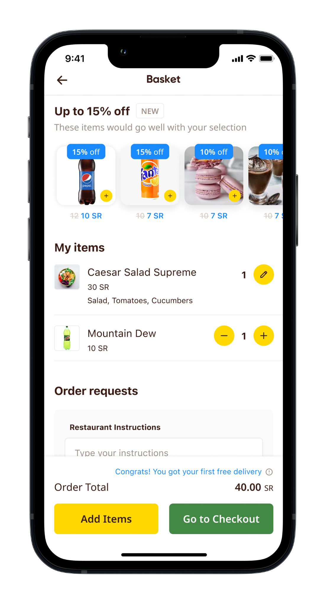 s63_basket_1.png
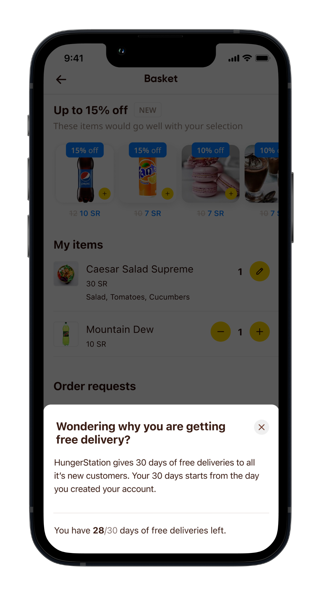 s63_basket_2.png
Separates the delivery offer from the rest.
 s64_basket_1.png
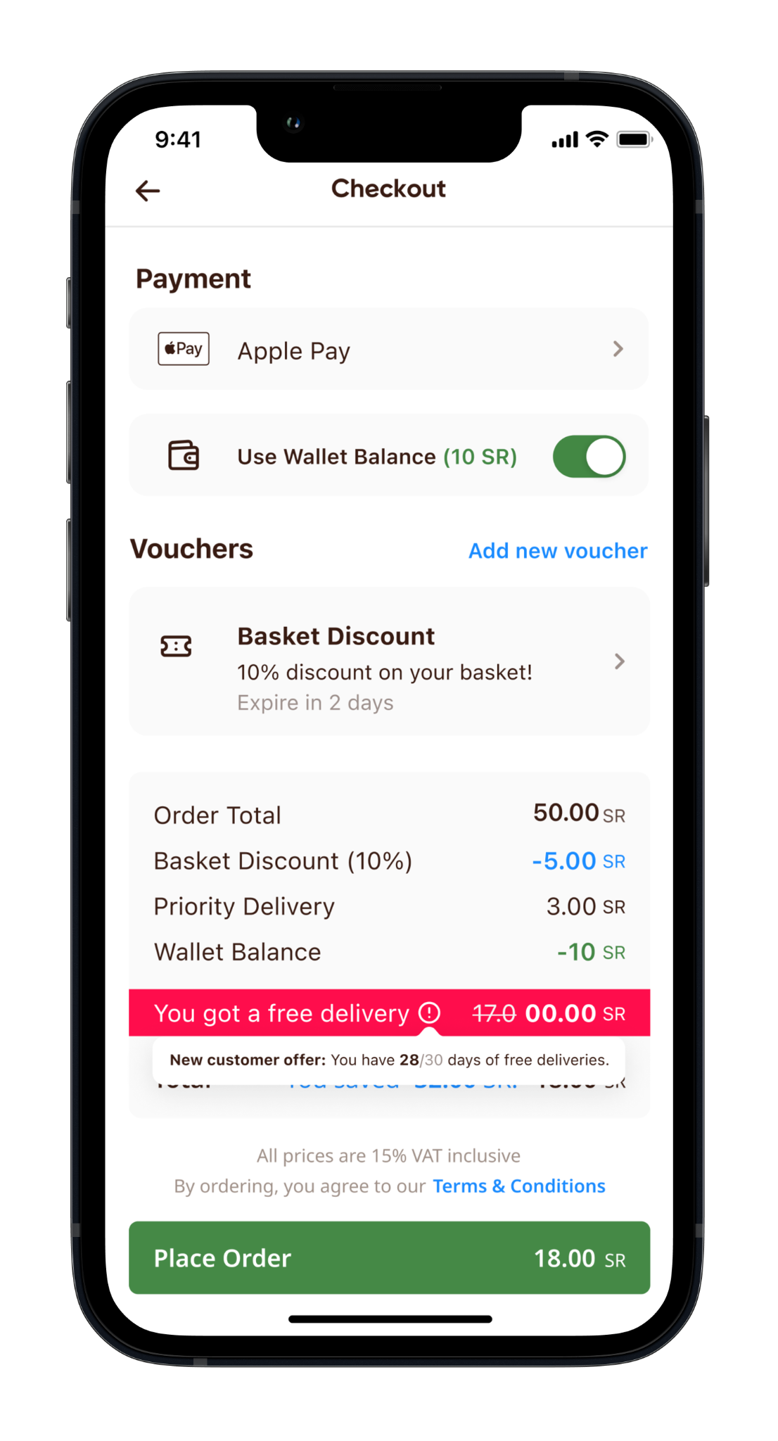 s64_basket_2.png
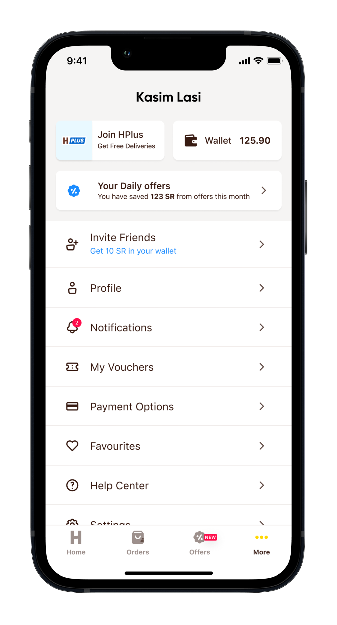
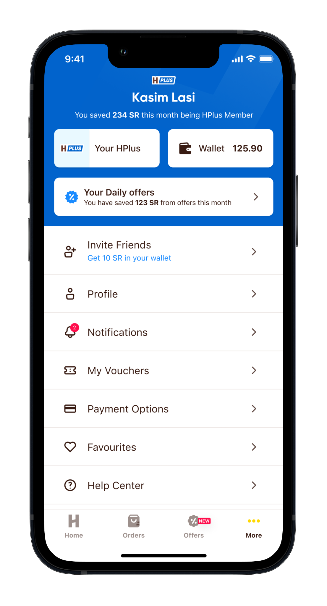
For non-HPlus users: a clear HPlus CTA, an offers entry point with the savings amount, & an invite-friends CTA with the reward. For HPlus customers: HPlus branding on the profile, savings of the month under the customer name, & a CTA retitled "Your HPlus".
 s68_notifications_1.png
 s68_notifications_2.png
Reminders for remaining free deliveries, wallet expiry, & HPlus expiry/renewal. Offers via collection/campaign cards & individual restaurant offers.
Real-time offer notifications on saved baskets. Tapping the push notification opens the notifications screen; "Continue to Basket" opens the basket. An active basket is disabled if the restaurant is unavailable.
The Offer Communication Visioning initiative established a shared strategic direction that shaped the evolution of HungerStation's offer ecosystem. The component-based approach created a scalable foundation for future development while significantly expanding the commercial capabilities available to Trade Marketing & Partner teams.
It introduced 9 reusable offer components - 6 of which directly expanded partner & commercial capability: four CPC-monetisable placements (the Happy Hours swimlane, offer-focused swimlanes, Exclusive on HungerStation, & Time-Focused Offers) plus two campaign-awareness surfaces (the Awareness Strip & Mini Awareness Banner). Together they gave commercial teams substantially more tools to merchandise campaigns, highlight time-sensitive promotions, personalise offers, & create new monetisable placements across the customer journey.
Post-launch, that translated into roughly ••••• incremental orders, ••••• in margin & ••••• in GMV per month.
Most importantly, the redesigned experience improved customer engagement with offers. Progression from the Offers screen to a restaurant menu rose from 14% to 52% - a 38-percentage-point improvement (≈271% growth) - showing that clearer communication, better discoverability & richer offer presentation moved customers from browsing to purchase consideration far more effectively.
At HungerStation, we had built a strong culture of shipping & continuous improvement. But as teams became increasingly focused on sprint-based delivery, our ability to step back & explore larger experience opportunities became limited.
Most design work naturally focused on immediate problems - improving a flow, refining a component, addressing the next backlog item. Valuable work, but it often treated symptoms rather than the broader opportunities that could reshape the customer experience. I initiated the Offer Communication Visioning Initiative to create space for a different kind of design thinking: moving beyond incremental optimisation to define a scalable future state for offer communication.
By bringing together Product, Design, Trade Marketing, Technology, Analytics & CX, we aligned around a shared vision that shifted the conversation from isolated features to a cohesive offer ecosystem. Instead of redesigning screens independently, we established reusable components, design principles & commercial patterns that could evolve across the entire customer journey.
The greatest success wasn't the concepts themselves - it was changing how the organisation approached experience design. The vision gave Trade Marketing & Partner teams a richer toolkit to communicate offers, while the redesigned experience helped lift progression from the Offers screen to restaurant menus from 14% to 52%. It demonstrated that investing in strategic visioning alongside day-to-day delivery can unlock both better customer experiences & measurable business outcomes.
These commercial figures are encrypted. Enter the passphrase to reveal them across the case study.